Lukas Grant Fabrications
How we built an accessibility first identity for a premium custom fabrication shop serving the hospitality sector.
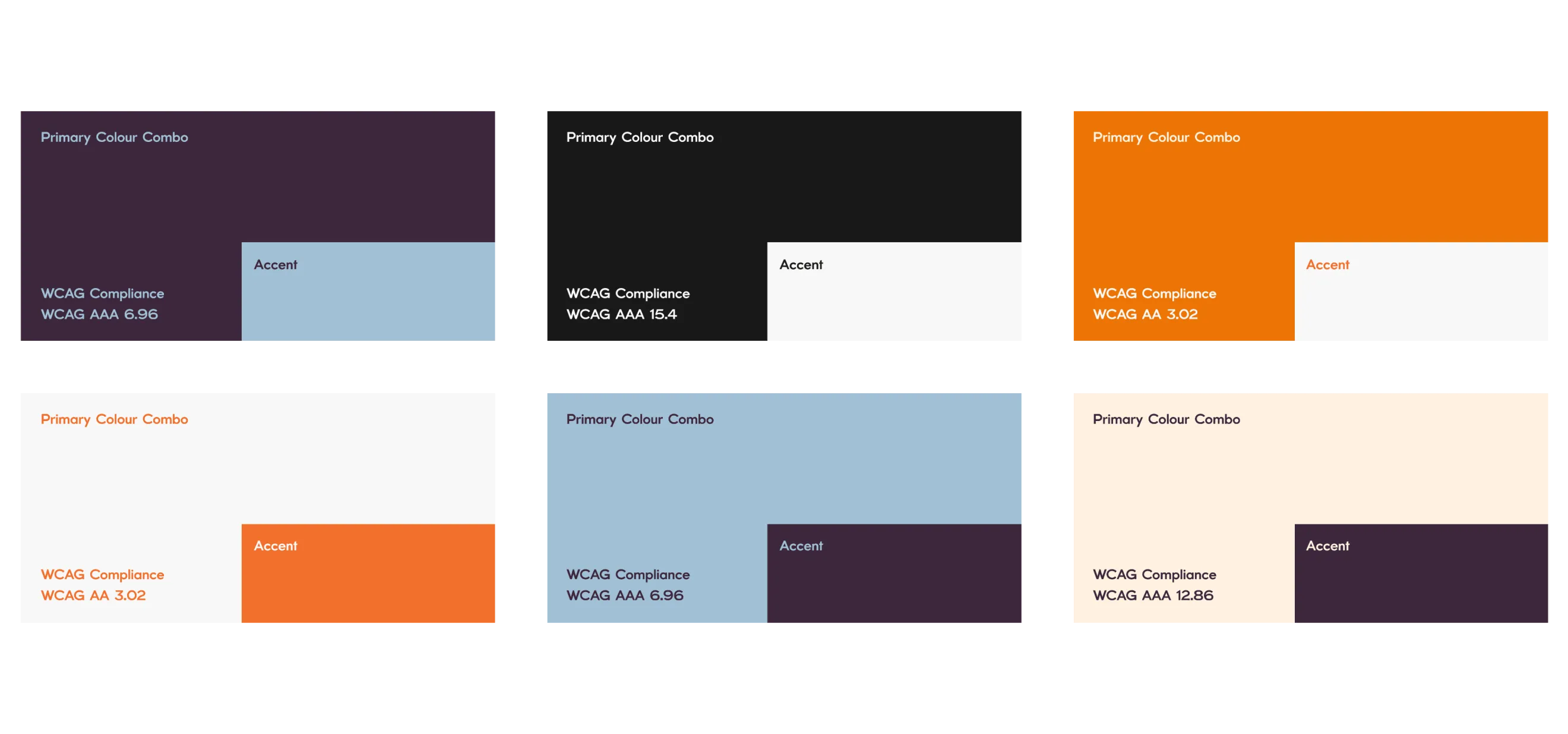
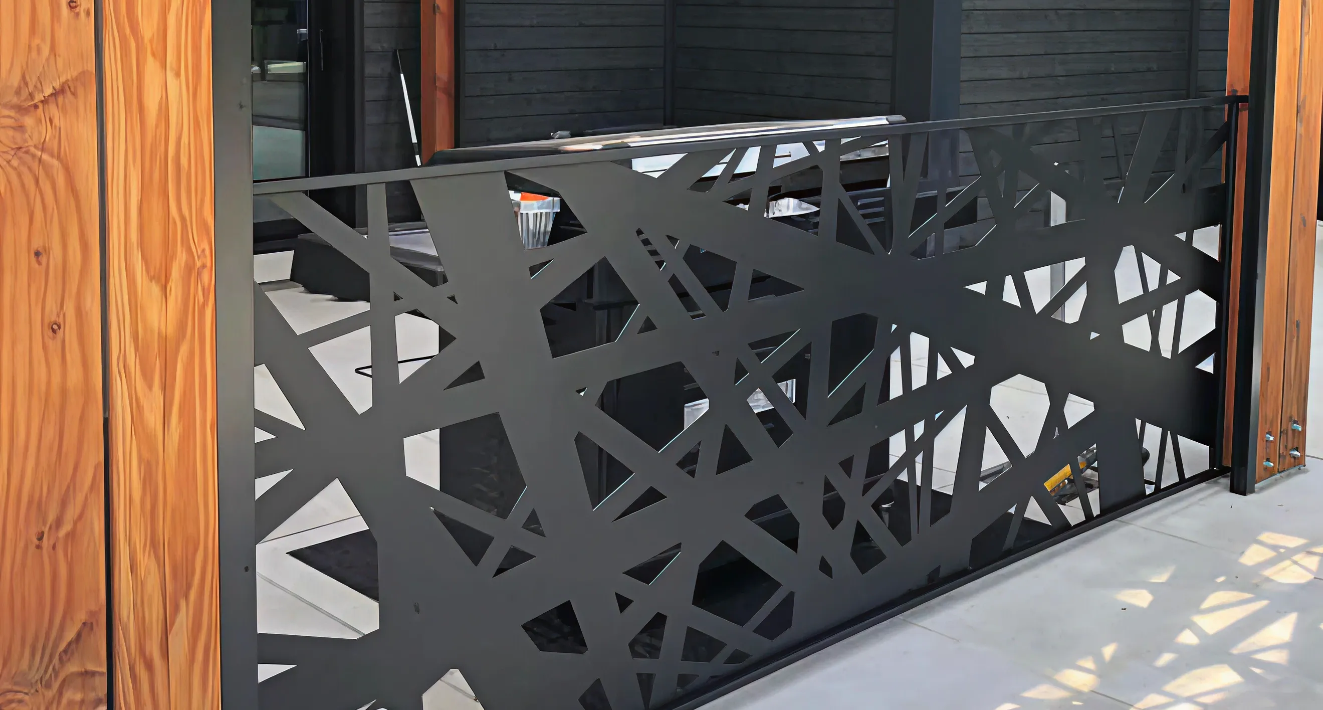
Lukas Grant Fabrications sits at a unique intersection, creating high quality, custom metalwork for Ottawa’s leading restaurants and cafés. The core challenge was to break away from generic trade branding and build a bold, '80s inspired working class identity that feels strong, modern, and professional. A major constraint was accessibility: the shop's owner is red green colour blind. This meant the identity couldn't just look visually striking to clients—it had to be fully functional for the owner to use in day to day operations.
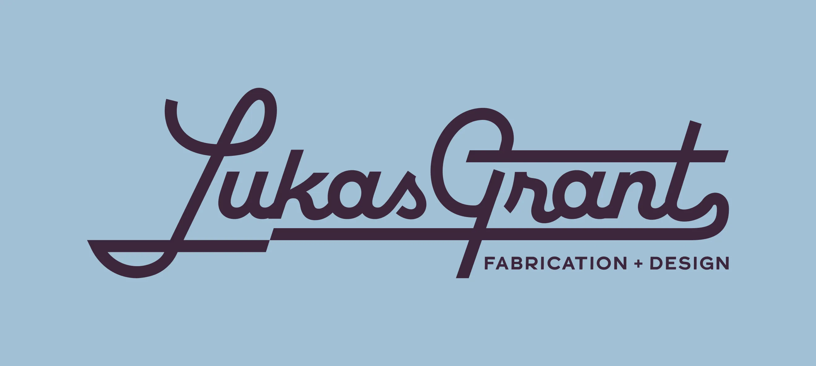
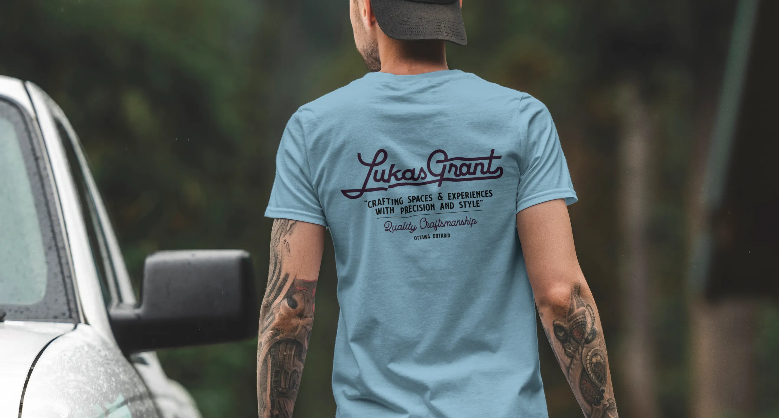
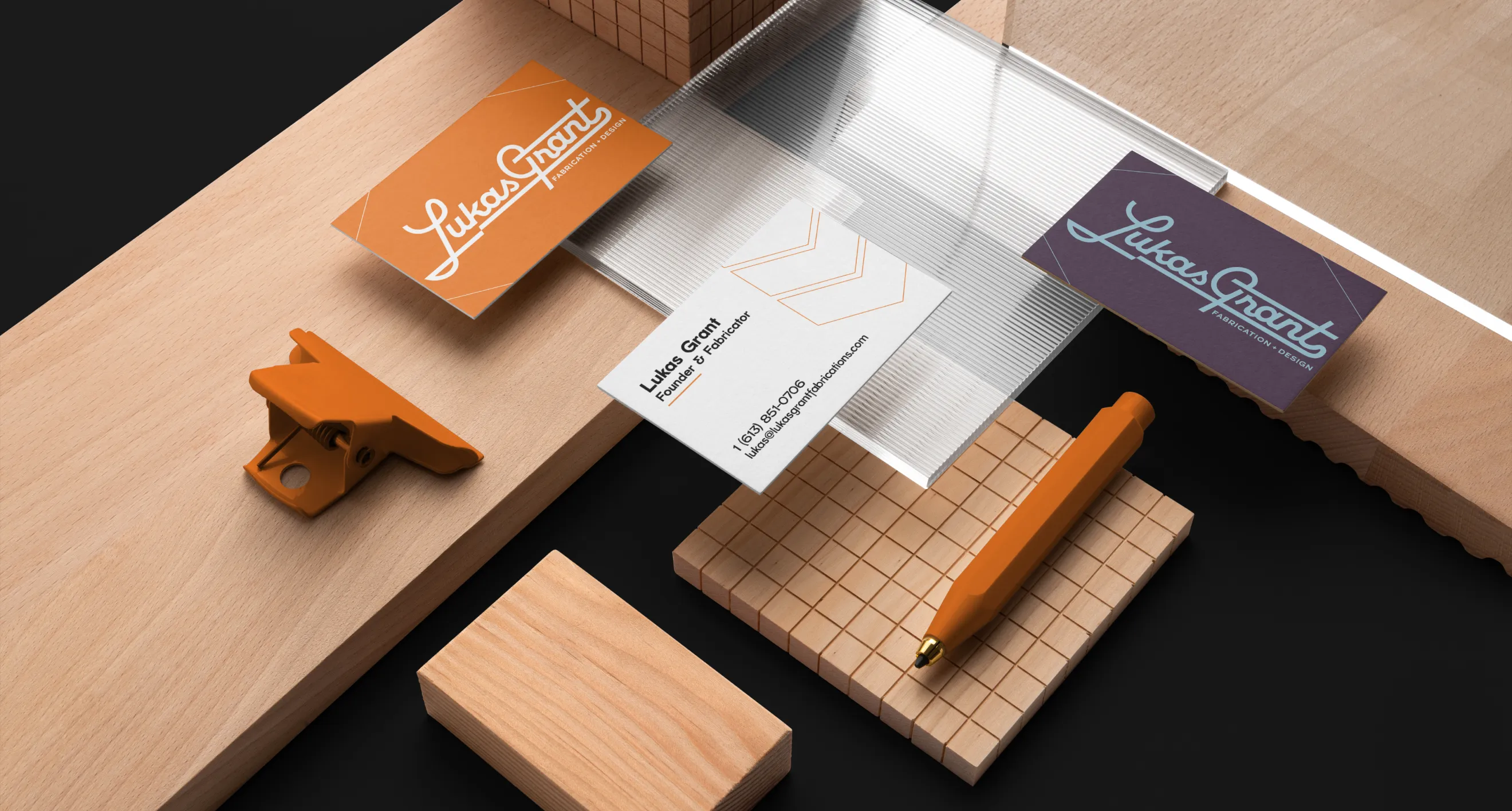
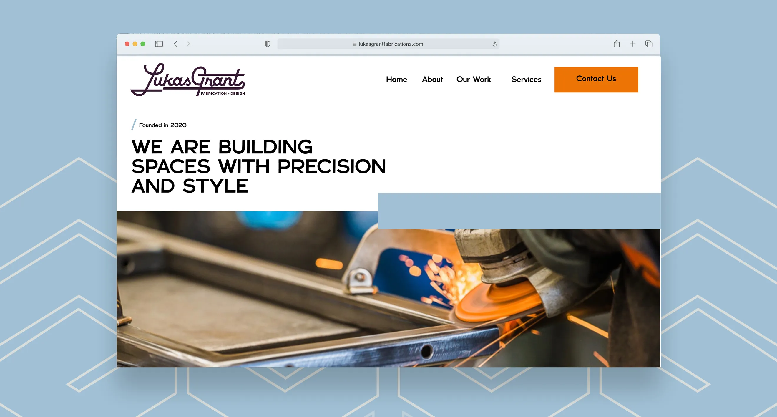
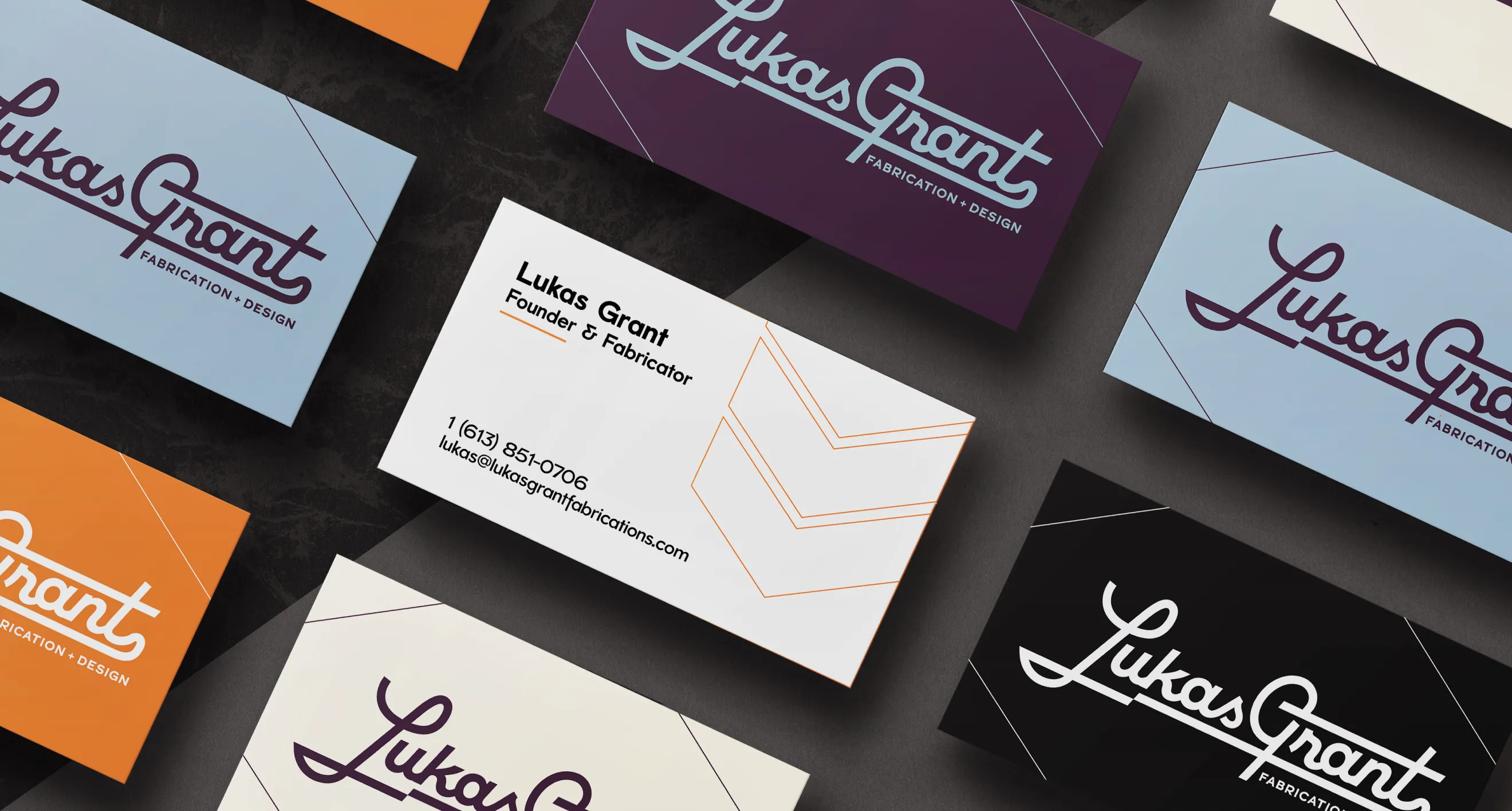
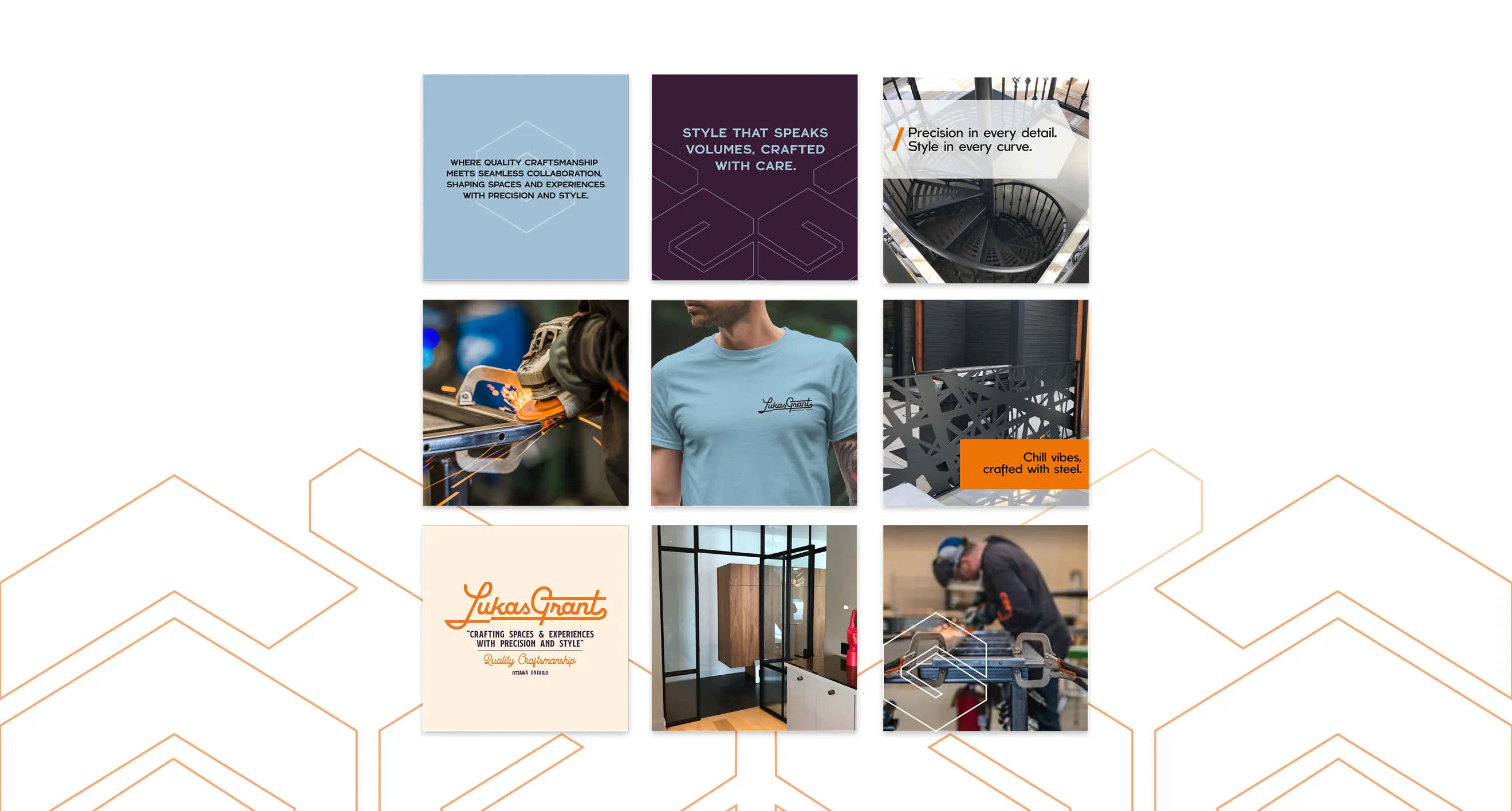
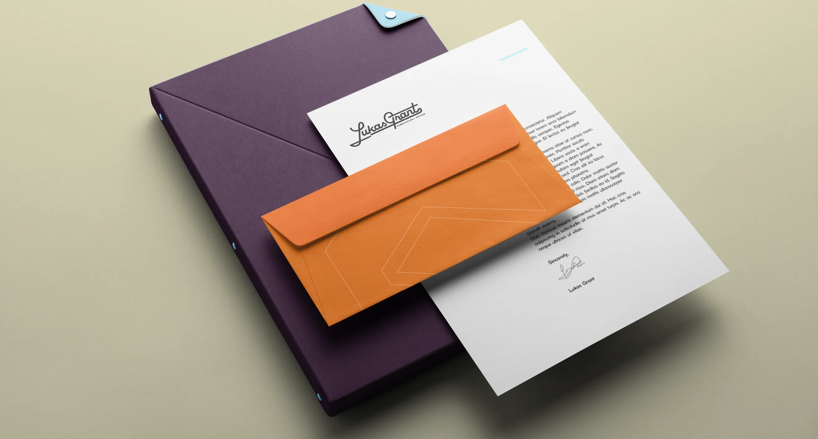
We engineered an accessibility first identity system with a colour strategy completely free from red-spectrum reliance, ensuring perfect usability for a colour blind owner. Visually, the design pairs a modern '80s inspired aesthetic with a refined edge—combining monoline script typography with a simplified crest logo that reflects industrial precision. The entire framework is built to scale smoothly across physical signage, internal documentation, and digital channels, positioning the studio as a top tier partner for the hospitality industry.
- Direction
- E-Commerce
- Web Design
- Experience
- Identity
- Messaging
- Web Development
- Direction
- Brand Messaging
- Brand Refresh
- Graphic Design
- 2D Motion
- Direction
- Positioning
- E-Commerce
- Identity
- Illustration
- Package Design
- Web Design & Development
- Direction
- Brand Refresh
- Graphic Design
- Illustration
- Direction
- Brand Identity
- Brand Refresh
- Illustration
- Direction
- Brand Refresh
- Brand Guidelines
- Digital Design
- Identity
- Direction
- Merch & Apparel Design
- Brand Architecture
- Identity
- Environmental
- Illustration
- Direction
- Merch & Apparel Design
- Brand Architecture
- Identity
- Illustration
- Direction
- Package Design
- Identity
- Illustration
- Merch & Apparel Design
- Direction
- Brand Refresh
- Brand Guidelines
- Identity
- Web Design
- Direction
- Brand Identity
- Naming
- Print Collateral
- Direction
- Package Design
- Brand Refresh
- Identity
- Direction
- Apparel & Merch Design
- Brand Refresh
- Identity
- Illustration
- Direction
- Brand Identity
- Brand Refresh
- Package Design
- Illustration
- Branding
- Identity
- Illustration
- Direction
- Brand Architecture
- Package Design
- Brand Identity
- Positioning
- Naming
- Illustration
- Messaging
- Direction
- Brand Architecture
- Package Design
- Brand Identity
- Positioning
- Naming
- Illustration
- Messaging
- Direction
- Brand Guidelines
- Brand Identity
- Illustration
- Graphic Design
- Direction
- Brand Architecture
- Positioning
- Naming
- Identity
- Messaging
- Print Collateral
- Labels
- Direction
- Social Campaign
- Branding
- Illustration
- Social Media
- Direction
- E-Commerce
- Web Design
- Experience
- Identity
- Messaging
- Web Development
- Direction
- Brand Messaging
- Brand Refresh
- Graphic Design
- 2D Motion
- Direction
- Positioning
- E-Commerce
- Identity
- Illustration
- Package Design
- Web Design & Development
- Direction
- Brand Refresh
- Graphic Design
- Illustration
- Direction
- Brand Identity
- Brand Refresh
- Illustration
- Direction
- Brand Refresh
- Brand Guidelines
- Digital Design
- Identity
- Direction
- Merch & Apparel Design
- Brand Architecture
- Identity
- Environmental
- Illustration
- Direction
- Merch & Apparel Design
- Brand Architecture
- Identity
- Illustration
- Direction
- Package Design
- Identity
- Illustration
- Merch & Apparel Design
- Direction
- Brand Refresh
- Brand Guidelines
- Identity
- Web Design
- Direction
- Brand Identity
- Naming
- Print Collateral
- Direction
- Package Design
- Brand Refresh
- Identity
- Direction
- Apparel & Merch Design
- Brand Refresh
- Identity
- Illustration
- Direction
- Brand Identity
- Brand Refresh
- Package Design
- Illustration
- Branding
- Identity
- Illustration
- Direction
- Brand Architecture
- Package Design
- Brand Identity
- Positioning
- Naming
- Illustration
- Messaging
- Direction
- Brand Architecture
- Package Design
- Brand Identity
- Positioning
- Naming
- Illustration
- Messaging
- Direction
- Brand Guidelines
- Brand Identity
- Illustration
- Graphic Design
- Direction
- Brand Architecture
- Positioning
- Naming
- Identity
- Messaging
- Print Collateral
- Labels
- Direction
- Social Campaign
- Branding
- Illustration
- Social Media
- Direction
- E-Commerce
- Web Design
- Experience
- Identity
- Messaging
- Web Development
- Direction
- Brand Messaging
- Brand Refresh
- Graphic Design
- 2D Motion
- Direction
- Positioning
- E-Commerce
- Identity
- Illustration
- Package Design
- Web Design & Development
- Direction
- Brand Refresh
- Graphic Design
- Illustration
- Direction
- Brand Identity
- Brand Refresh
- Illustration
- Direction
- Brand Refresh
- Brand Guidelines
- Digital Design
- Identity
- Direction
- Merch & Apparel Design
- Brand Architecture
- Identity
- Environmental
- Illustration
- Direction
- Merch & Apparel Design
- Brand Architecture
- Identity
- Illustration
- Direction
- Package Design
- Identity
- Illustration
- Merch & Apparel Design
- Direction
- Brand Refresh
- Brand Guidelines
- Identity
- Web Design
- Direction
- Brand Identity
- Naming
- Print Collateral
- Direction
- Package Design
- Brand Refresh
- Identity
- Direction
- Apparel & Merch Design
- Brand Refresh
- Identity
- Illustration
- Direction
- Brand Identity
- Brand Refresh
- Package Design
- Illustration
- Branding
- Identity
- Illustration
- Direction
- Brand Architecture
- Package Design
- Brand Identity
- Positioning
- Naming
- Illustration
- Messaging
- Direction
- Brand Architecture
- Package Design
- Brand Identity
- Positioning
- Naming
- Illustration
- Messaging
- Direction
- Brand Guidelines
- Brand Identity
- Illustration
- Graphic Design
- Direction
- Brand Architecture
- Positioning
- Naming
- Identity
- Messaging
- Print Collateral
- Labels
- Direction
- Social Campaign
- Branding
- Illustration
- Social Media
- Direction
- E-Commerce
- Web Design
- Experience
- Identity
- Messaging
- Web Development
- Direction
- Brand Messaging
- Brand Refresh
- Graphic Design
- 2D Motion
- Direction
- Positioning
- E-Commerce
- Identity
- Illustration
- Package Design
- Web Design & Development
- Direction
- Brand Refresh
- Graphic Design
- Illustration
- Direction
- Brand Identity
- Brand Refresh
- Illustration
- Direction
- Brand Refresh
- Brand Guidelines
- Digital Design
- Identity
- Direction
- Merch & Apparel Design
- Brand Architecture
- Identity
- Environmental
- Illustration
- Direction
- Merch & Apparel Design
- Brand Architecture
- Identity
- Illustration
- Direction
- Package Design
- Identity
- Illustration
- Merch & Apparel Design
- Direction
- Brand Refresh
- Brand Guidelines
- Identity
- Web Design
- Direction
- Brand Identity
- Naming
- Print Collateral
- Direction
- Package Design
- Brand Refresh
- Identity
- Direction
- Apparel & Merch Design
- Brand Refresh
- Identity
- Illustration
- Direction
- Brand Identity
- Brand Refresh
- Package Design
- Illustration
- Branding
- Identity
- Illustration
- Direction
- Brand Architecture
- Package Design
- Brand Identity
- Positioning
- Naming
- Illustration
- Messaging
- Direction
- Brand Architecture
- Package Design
- Brand Identity
- Positioning
- Naming
- Illustration
- Messaging
- Direction
- Brand Guidelines
- Brand Identity
- Illustration
- Graphic Design
- Direction
- Brand Architecture
- Positioning
- Naming
- Identity
- Messaging
- Print Collateral
- Labels
- Direction
- Social Campaign
- Branding
- Illustration
- Social Media
- Direction
- E-Commerce
- Web Design
- Experience
- Identity
- Messaging
- Web Development
- Direction
- Brand Messaging
- Brand Refresh
- Graphic Design
- 2D Motion
- Direction
- Positioning
- E-Commerce
- Identity
- Illustration
- Package Design
- Web Design & Development
- Direction
- Brand Refresh
- Graphic Design
- Illustration
- Direction
- Brand Identity
- Brand Refresh
- Illustration
- Direction
- Brand Refresh
- Brand Guidelines
- Digital Design
- Identity
- Direction
- Merch & Apparel Design
- Brand Architecture
- Identity
- Environmental
- Illustration
- Direction
- Merch & Apparel Design
- Brand Architecture
- Identity
- Illustration
- Direction
- Package Design
- Identity
- Illustration
- Merch & Apparel Design
- Direction
- Brand Refresh
- Brand Guidelines
- Identity
- Web Design
- Direction
- Brand Identity
- Naming
- Print Collateral
- Direction
- Package Design
- Brand Refresh
- Identity
- Direction
- Apparel & Merch Design
- Brand Refresh
- Identity
- Illustration
- Direction
- Brand Identity
- Brand Refresh
- Package Design
- Illustration
- Branding
- Identity
- Illustration
- Direction
- Brand Architecture
- Package Design
- Brand Identity
- Positioning
- Naming
- Illustration
- Messaging
- Direction
- Brand Architecture
- Package Design
- Brand Identity
- Positioning
- Naming
- Illustration
- Messaging
- Direction
- Brand Guidelines
- Brand Identity
- Illustration
- Graphic Design
- Direction
- Brand Architecture
- Positioning
- Naming
- Identity
- Messaging
- Print Collateral
- Labels
- Direction
- Social Campaign
- Branding
- Illustration
- Social Media
- Direction
- E-Commerce
- Web Design
- Experience
- Identity
- Messaging
- Web Development
- Direction
- Brand Messaging
- Brand Refresh
- Graphic Design
- 2D Motion
- Direction
- Positioning
- E-Commerce
- Identity
- Illustration
- Package Design
- Web Design & Development
- Direction
- Brand Refresh
- Graphic Design
- Illustration
- Direction
- Brand Identity
- Brand Refresh
- Illustration
- Direction
- Brand Refresh
- Brand Guidelines
- Digital Design
- Identity
- Direction
- Merch & Apparel Design
- Brand Architecture
- Identity
- Environmental
- Illustration
- Direction
- Merch & Apparel Design
- Brand Architecture
- Identity
- Illustration
- Direction
- Package Design
- Identity
- Illustration
- Merch & Apparel Design
- Direction
- Brand Refresh
- Brand Guidelines
- Identity
- Web Design
- Direction
- Brand Identity
- Naming
- Print Collateral
- Direction
- Package Design
- Brand Refresh
- Identity
- Direction
- Apparel & Merch Design
- Brand Refresh
- Identity
- Illustration
- Direction
- Brand Identity
- Brand Refresh
- Package Design
- Illustration
- Branding
- Identity
- Illustration
- Direction
- Brand Architecture
- Package Design
- Brand Identity
- Positioning
- Naming
- Illustration
- Messaging
- Direction
- Brand Architecture
- Package Design
- Brand Identity
- Positioning
- Naming
- Illustration
- Messaging
- Direction
- Brand Guidelines
- Brand Identity
- Illustration
- Graphic Design
- Direction
- Brand Architecture
- Positioning
- Naming
- Identity
- Messaging
- Print Collateral
- Labels
- Direction
- Social Campaign
- Branding
- Illustration
- Social Media
- Direction
- E-Commerce
- Web Design
- Experience
- Identity
- Messaging
- Web Development
- Direction
- Brand Messaging
- Brand Refresh
- Graphic Design
- 2D Motion
- Direction
- Positioning
- E-Commerce
- Identity
- Illustration
- Package Design
- Web Design & Development
- Direction
- Brand Refresh
- Graphic Design
- Illustration
- Direction
- Brand Identity
- Brand Refresh
- Illustration
- Direction
- Brand Refresh
- Brand Guidelines
- Digital Design
- Identity
- Direction
- Merch & Apparel Design
- Brand Architecture
- Identity
- Environmental
- Illustration
- Direction
- Merch & Apparel Design
- Brand Architecture
- Identity
- Illustration
- Package Design
- Direction
- Package Design
- Identity
- Illustration
- Merch & Apparel Design
- Direction
- Brand Refresh
- Brand Guidelines
- Identity
- Web Design
- Direction
- Brand Identity
- Naming
- Print Collateral
- Direction
- Package Design
- Brand Refresh
- Identity
- Direction
- Apparel & Merch Design
- Brand Refresh
- Identity
- Illustration
- Direction
- Brand Identity
- Brand Refresh
- Package Design
- Illustration
- Branding
- Identity
- Illustration
- Direction
- Brand Architecture
- Package Design
- Brand Identity
- Positioning
- Naming
- Illustration
- Messaging
- Direction
- Brand Architecture
- Package Design
- Brand Identity
- Positioning
- Naming
- Illustration
- Messaging
- Direction
- Brand Guidelines
- Brand Identity
- Illustration
- Graphic Design
- Direction
- Brand Architecture
- Positioning
- Naming
- Identity
- Messaging
- Print Collateral
- Labels
- Direction
- Social Campaign
- Branding
- Illustration
- Social Media
- Direction
- E-Commerce
- Web Design
- Experience
- Identity
- Messaging
- Web Development
- Direction
- Brand Messaging
- Brand Refresh
- Graphic Design
- 2D Motion
- Direction
- Positioning
- E-Commerce
- Identity
- Illustration
- Package Design
- Web Design & Development
- Direction
- Brand Refresh
- Graphic Design
- Illustration
- Direction
- Brand Identity
- Brand Refresh
- Illustration
- Direction
- Brand Refresh
- Brand Guidelines
- Digital Design
- Identity
- Direction
- Merch & Apparel Design
- Brand Architecture
- Identity
- Environmental
- Illustration
- Direction
- Merch & Apparel Design
- Brand Architecture
- Identity
- Illustration
- Direction
- Package Design
- Identity
- Illustration
- Merch & Apparel Design
- Direction
- Brand Refresh
- Brand Guidelines
- Identity
- Web Design
- Direction
- Brand Identity
- Naming
- Print Collateral
- Direction
- Package Design
- Brand Refresh
- Identity
- Direction
- Apparel & Merch Design
- Brand Refresh
- Identity
- Illustration
- Direction
- Brand Identity
- Brand Refresh
- Package Design
- Illustration
- Branding
- Identity
- Illustration
- Direction
- Brand Architecture
- Package Design
- Brand Identity
- Positioning
- Naming
- Illustration
- Messaging
- Direction
- Brand Architecture
- Package Design
- Brand Identity
- Positioning
- Naming
- Illustration
- Messaging
- Direction
- Brand Guidelines
- Brand Identity
- Illustration
- Graphic Design
- Direction
- Brand Architecture
- Positioning
- Naming
- Identity
- Messaging
- Print Collateral
- Labels
- Direction
- Social Campaign
- Branding
- Illustration
- Social Media
- Direction
- E-Commerce
- Web Design
- Experience
- Identity
- Messaging
- Web Development
- Direction
- Brand Messaging
- Brand Refresh
- Graphic Design
- 2D Motion
- Direction
- Positioning
- E-Commerce
- Identity
- Illustration
- Package Design
- Web Design & Development
- Direction
- Brand Refresh
- Graphic Design
- Illustration
- Direction
- Brand Identity
- Brand Refresh
- Illustration
- Direction
- Brand Refresh
- Brand Guidelines
- Digital Design
- Identity
- Direction
- Merch & Apparel Design
- Brand Architecture
- Identity
- Environmental
- Illustration
- Direction
- Merch & Apparel Design
- Brand Architecture
- Identity
- Illustration
- Direction
- Package Design
- Identity
- Illustration
- Merch & Apparel Design
- Direction
- Brand Refresh
- Brand Guidelines
- Identity
- Web Design
- Direction
- Brand Identity
- Naming
- Print Collateral
- Direction
- Package Design
- Brand Refresh
- Identity
- Direction
- Apparel & Merch Design
- Brand Refresh
- Identity
- Illustration
- Direction
- Brand Identity
- Brand Refresh
- Package Design
- Illustration
- Branding
- Identity
- Illustration
- Direction
- Brand Architecture
- Package Design
- Brand Identity
- Positioning
- Naming
- Illustration
- Messaging
- Direction
- Brand Architecture
- Package Design
- Brand Identity
- Positioning
- Naming
- Illustration
- Messaging
- Direction
- Brand Guidelines
- Brand Identity
- Illustration
- Graphic Design
- Direction
- Brand Architecture
- Positioning
- Naming
- Identity
- Messaging
- Print Collateral
- Labels
- Direction
- Social Campaign
- Branding
- Illustration
- Social Media
- Direction
- E-Commerce
- Web Design
- Experience
- Identity
- Messaging
- Web Development
- Direction
- Brand Messaging
- Brand Refresh
- Graphic Design
- 2D Motion
- Direction
- Positioning
- E-Commerce
- Identity
- Illustration
- Package Design
- Web Design & Development
- Direction
- Brand Refresh
- Graphic Design
- Illustration
- Direction
- Brand Identity
- Brand Refresh
- Illustration
- Direction
- Brand Refresh
- Brand Guidelines
- Digital Design
- Identity
- Direction
- Merch & Apparel Design
- Brand Architecture
- Identity
- Environmental
- Illustration
- Direction
- Merch & Apparel Design
- Brand Architecture
- Identity
- Illustration
- Direction
- Package Design
- Identity
- Illustration
- Merch & Apparel Design
- Direction
- Brand Refresh
- Brand Guidelines
- Identity
- Web Design
- Direction
- Brand Identity
- Naming
- Print Collateral
- Direction
- Package Design
- Brand Refresh
- Identity
- Direction
- Apparel & Merch Design
- Brand Refresh
- Identity
- Illustration
- Direction
- Brand Identity
- Brand Refresh
- Package Design
- Illustration
- Branding
- Identity
- Illustration
- Direction
- Brand Architecture
- Package Design
- Brand Identity
- Positioning
- Naming
- Illustration
- Messaging
- Direction
- Brand Architecture
- Package Design
- Brand Identity
- Positioning
- Naming
- Illustration
- Messaging
- Direction
- Brand Guidelines
- Brand Identity
- Illustration
- Graphic Design
- Direction
- Brand Architecture
- Positioning
- Naming
- Identity
- Messaging
- Print Collateral
- Labels
- Direction
- Social Campaign
- Branding
- Illustration
- Social Media
- Direction
- E-Commerce
- Web Design
- Experience
- Identity
- Messaging
- Web Development
- Direction
- Brand Messaging
- Brand Refresh
- Graphic Design
- 2D Motion
- Direction
- Positioning
- E-Commerce
- Identity
- Illustration
- Package Design
- Web Design & Development
- Direction
- Brand Refresh
- Graphic Design
- Illustration
- Direction
- Brand Identity
- Brand Refresh
- Illustration
- Direction
- Brand Refresh
- Brand Guidelines
- Digital Design
- Identity
- Direction
- Merch & Apparel Design
- Brand Architecture
- Identity
- Environmental
- Illustration
- Direction
- Merch & Apparel Design
- Brand Architecture
- Identity
- Illustration
- Direction
- Package Design
- Identity
- Illustration
- Merch & Apparel Design
- Direction
- Brand Refresh
- Brand Guidelines
- Identity
- Web Design
- Direction
- Brand Identity
- Naming
- Print Collateral
- Direction
- Package Design
- Brand Refresh
- Identity
- Direction
- Apparel & Merch Design
- Brand Refresh
- Identity
- Illustration
- Direction
- Brand Identity
- Brand Refresh
- Package Design
- Illustration
- Branding
- Identity
- Illustration
- Direction
- Brand Architecture
- Package Design
- Brand Identity
- Positioning
- Naming
- Illustration
- Messaging
- Direction
- Brand Architecture
- Package Design
- Brand Identity
- Positioning
- Naming
- Illustration
- Messaging
- Direction
- Brand Guidelines
- Brand Identity
- Illustration
- Graphic Design
- Direction
- Brand Architecture
- Positioning
- Naming
- Identity
- Messaging
- Print Collateral
- Labels
- Direction
- Social Campaign
- Branding
- Illustration
- Social Media
- Direction
- E-Commerce
- Web Design
- Experience
- Identity
- Messaging
- Web Development
- Direction
- Brand Messaging
- Brand Refresh
- Graphic Design
- 2D Motion
- Direction
- Positioning
- E-Commerce
- Identity
- Illustration
- Package Design
- Web Design & Development
- Direction
- Brand Refresh
- Graphic Design
- Illustration
- Direction
- Brand Identity
- Brand Refresh
- Illustration
- Direction
- Brand Refresh
- Brand Guidelines
- Digital Design
- Identity
- Direction
- Merch & Apparel Design
- Brand Architecture
- Identity
- Environmental
- Illustration
- Direction
- Merch & Apparel Design
- Brand Architecture
- Identity
- Illustration
- Direction
- Package Design
- Identity
- Illustration
- Merch & Apparel Design
- Direction
- Brand Refresh
- Brand Guidelines
- Identity
- Web Design
- Direction
- Brand Identity
- Naming
- Print Collateral
- Direction
- Package Design
- Brand Refresh
- Identity
- Direction
- Apparel & Merch Design
- Brand Refresh
- Identity
- Illustration
- Direction
- Brand Identity
- Brand Refresh
- Package Design
- Illustration
- Branding
- Identity
- Illustration
- Direction
- Brand Architecture
- Package Design
- Brand Identity
- Positioning
- Naming
- Illustration
- Messaging
- Direction
- Brand Architecture
- Package Design
- Brand Identity
- Positioning
- Naming
- Illustration
- Messaging
- Direction
- Brand Guidelines
- Brand Identity
- Illustration
- Graphic Design
- Direction
- Brand Architecture
- Positioning
- Naming
- Identity
- Messaging
- Print Collateral
- Labels
- Direction
- Social Campaign
- Branding
- Illustration
- Social Media
- Direction
- E-Commerce
- Web Design
- Experience
- Identity
- Messaging
- Web Development
- Direction
- Brand Messaging
- Brand Refresh
- Graphic Design
- 2D Motion
- Direction
- Positioning
- E-Commerce
- Identity
- Illustration
- Package Design
- Web Design & Development
- Direction
- Brand Refresh
- Graphic Design
- Illustration
- Direction
- Brand Identity
- Brand Refresh
- Illustration
- Direction
- Brand Refresh
- Brand Guidelines
- Digital Design
- Identity
- Direction
- Merch & Apparel Design
- Brand Architecture
- Identity
- Environmental
- Illustration
- Direction
- Merch & Apparel Design
- Brand Architecture
- Identity
- Illustration
- Direction
- Package Design
- Identity
- Illustration
- Merch & Apparel Design
- Direction
- Brand Refresh
- Brand Guidelines
- Identity
- Web Design
- Direction
- Brand Identity
- Naming
- Print Collateral
- Direction
- Package Design
- Brand Refresh
- Identity
- Direction
- Apparel & Merch Design
- Brand Refresh
- Identity
- Illustration
- Direction
- Brand Identity
- Brand Refresh
- Package Design
- Illustration
- Branding
- Identity
- Illustration
- Direction
- Brand Architecture
- Package Design
- Brand Identity
- Positioning
- Naming
- Illustration
- Messaging
- Direction
- Brand Architecture
- Package Design
- Brand Identity
- Positioning
- Naming
- Illustration
- Messaging
- Direction
- Brand Guidelines
- Brand Identity
- Illustration
- Graphic Design
- Direction
- Brand Architecture
- Positioning
- Naming
- Identity
- Messaging
- Print Collateral
- Labels
- Direction
- Social Campaign
- Branding
- Illustration
- Social Media
- Direction
- E-Commerce
- Web Design
- Experience
- Identity
- Messaging
- Web Development
- Direction
- Brand Messaging
- Brand Refresh
- Graphic Design
- 2D Motion
- Direction
- Positioning
- E-Commerce
- Identity
- Illustration
- Package Design
- Web Design & Development
- Direction
- Brand Refresh
- Graphic Design
- Illustration
- Direction
- Brand Identity
- Brand Refresh
- Illustration
- Direction
- Brand Refresh
- Brand Guidelines
- Digital Design
- Identity
- Direction
- Merch & Apparel Design
- Brand Architecture
- Identity
- Environmental
- Illustration
- Direction
- Merch & Apparel Design
- Brand Architecture
- Identity
- Illustration
- Direction
- Package Design
- Identity
- Illustration
- Merch & Apparel Design
- Direction
- Brand Refresh
- Brand Guidelines
- Identity
- Web Design
- Direction
- Brand Identity
- Naming
- Print Collateral
- Direction
- Package Design
- Brand Refresh
- Identity
- Direction
- Apparel & Merch Design
- Brand Refresh
- Identity
- Illustration
- Direction
- Brand Identity
- Brand Refresh
- Package Design
- Illustration
- Branding
- Identity
- Illustration
- Direction
- Brand Architecture
- Package Design
- Brand Identity
- Positioning
- Naming
- Illustration
- Messaging
- Direction
- Brand Architecture
- Package Design
- Brand Identity
- Positioning
- Naming
- Illustration
- Messaging
- Direction
- Brand Guidelines
- Brand Identity
- Illustration
- Graphic Design
- Direction
- Brand Architecture
- Positioning
- Naming
- Identity
- Messaging
- Print Collateral
- Labels
- Direction
- Social Campaign
- Branding
- Illustration
- Social Media
- Direction
- E-Commerce
- Web Design
- Experience
- Identity
- Messaging
- Web Development
- Direction
- Brand Messaging
- Brand Refresh
- Graphic Design
- 2D Motion
- Direction
- Positioning
- E-Commerce
- Identity
- Illustration
- Package Design
- Web Design & Development
- Direction
- Brand Refresh
- Graphic Design
- Illustration
- Direction
- Brand Identity
- Brand Refresh
- Illustration
- Direction
- Brand Refresh
- Brand Guidelines
- Digital Design
- Identity
- Direction
- Merch & Apparel Design
- Brand Architecture
- Identity
- Environmental
- Illustration
- Direction
- Merch & Apparel Design
- Brand Architecture
- Identity
- Illustration
- Direction
- Package Design
- Identity
- Illustration
- Merch & Apparel Design
- Direction
- Brand Refresh
- Brand Guidelines
- Identity
- Web Design
- Direction
- Brand Identity
- Naming
- Print Collateral
- Direction
- Package Design
- Brand Refresh
- Identity
- Direction
- Apparel Designs
- Brand Refresh
- Identity
- Illustration
- Direction
- Brand Identity
- Brand Refresh
- Package Design
- Illustration
- Branding
- Identity
- Illustration
- Direction
- Brand Architecture
- Package Design
- Brand Identity
- Positioning
- Naming
- Illustration
- Messaging
- Direction
- Brand Architecture
- Package Design
- Brand Identity
- Positioning
- Naming
- Illustration
- Messaging
- Direction
- Brand Guidelines
- Brand Identity
- Illustration
- Graphic Design
- Direction
- Brand Architecture
- Positioning
- Naming
- Identity
- Messaging
- Print Collateral
- Labels
- Direction
- Social Campaign
- Branding
- Illustration
- Social Media
- Direction
- E-Commerce
- Web Design
- Experience
- Identity
- Messaging
- Web Development
- Direction
- Brand Messaging
- Brand Refresh
- Graphic Design
- 2D Motion
- Direction
- Positioning
- E-Commerce
- Identity
- Illustration
- Package Design
- Web Design & Development
- Direction
- Brand Refresh
- Graphic Design
- Illustration
- Direction
- Brand Identity
- Brand Refresh
- Illustration
- Direction
- Brand Refresh
- Brand Guidelines
- Digital Design
- Identity
- Direction
- Merch & Apparel Design
- Brand Architecture
- Identity
- Environmental
- Illustration
- Direction
- Merch & Apparel Design
- Brand Architecture
- Identity
- Illustration
- Direction
- Package Design
- Identity
- Illustration
- Merch & Apparel Design
- Direction
- Brand Refresh
- Brand Guidelines
- Identity
- Web Design
- Direction
- Brand Identity
- Naming
- Print Collateral
- Direction
- Package Design
- Brand Refresh
- Identity
- Direction
- Apparel & Merch Design
- Brand Refresh
- Identity
- Illustration
- Direction
- Brand Identity
- Brand Refresh
- Package Design
- Illustration
- Branding
- Identity
- Illustration
- Direction
- Brand Architecture
- Package Design
- Brand Identity
- Positioning
- Naming
- Illustration
- Messaging
- Direction
- Brand Architecture
- Package Design
- Brand Identity
- Positioning
- Naming
- Illustration
- Messaging
- Direction
- Brand Guidelines
- Brand Identity
- Illustration
- Graphic Design
- Direction
- Brand Architecture
- Positioning
- Naming
- Identity
- Messaging
- Print Collateral
- Labels
- Direction
- Social Campaign
- Branding
- Illustration
- Social Media
- Direction
- E-Commerce
- Web Design
- Experience
- Identity
- Messaging
- Web Development
- Direction
- Brand Messaging
- Brand Refresh
- Graphic Design
- 2D Motion
- Direction
- Positioning
- E-Commerce
- Identity
- Illustration
- Package Design
- Web Design & Development
- Direction
- Brand Refresh
- Graphic Design
- Illustration
- Direction
- Brand Identity
- Brand Refresh
- Illustration
- Direction
- Brand Refresh
- Brand Guidelines
- Digital Design
- Identity
- Direction
- Merch & Apparel Design
- Brand Architecture
- Identity
- Environmental
- Illustration
- Direction
- Merch & Apparel Design
- Brand Architecture
- Identity
- Illustration
- Direction
- Package Design
- Identity
- Illustration
- Merch & Apparel Design
- Direction
- Brand Refresh
- Brand Guidelines
- Identity
- Web Design
- Direction
- Brand Identity
- Naming
- Print Collateral
- Direction
- Package Design
- Brand Refresh
- Identity
- Direction
- Apparel & Merch Design
- Brand Refresh
- Identity
- Illustration
- Direction
- Brand Identity
- Brand Refresh
- Package Design
- Illustration
- Branding
- Identity
- Illustration
- Direction
- Brand Architecture
- Package Design
- Brand Identity
- Positioning
- Naming
- Illustration
- Messaging
- Direction
- Brand Architecture
- Package Design
- Brand Identity
- Positioning
- Naming
- Illustration
- Messaging
- Direction
- Brand Guidelines
- Brand Identity
- Illustration
- Graphic Design
- Direction
- Brand Architecture
- Positioning
- Naming
- Identity
- Messaging
- Print Collateral
- Labels
- Direction
- Social Campaign
- Branding
- Illustration
- Social Media
- Direction
- E-Commerce
- Web Design
- Experience
- Identity
- Messaging
- Web Development
- Direction
- Brand Messaging
- Brand Refresh
- Graphic Design
- 2D Motion
- Direction
- Positioning
- E-Commerce
- Identity
- Illustration
- Package Design
- Web Design & Development
- Direction
- Brand Refresh
- Graphic Design
- Illustration
- Direction
- Brand Identity
- Brand Refresh
- Illustration
- Direction
- Brand Refresh
- Brand Guidelines
- Digital Design
- Identity
- Direction
- Merch & Apparel Design
- Brand Architecture
- Identity
- Environmental
- Illustration
- Direction
- Merch & Apparel Design
- Brand Architecture
- Identity
- Illustration
- Direction
- Package Design
- Identity
- Illustration
- Merch & Apparel Design
- Direction
- Brand Refresh
- Brand Guidelines
- Identity
- Web Design
- Direction
- Brand Identity
- Naming
- Print Collateral
- Direction
- Package Design
- Brand Refresh
- Identity
- Direction
- Apparel & Merch Design
- Brand Refresh
- Identity
- Illustration
- Direction
- Brand Identity
- Brand Refresh
- Package Design
- Illustration
- Branding
- Identity
- Illustration
- Direction
- Brand Architecture
- Package Design
- Brand Identity
- Positioning
- Naming
- Illustration
- Messaging
- Direction
- Brand Architecture
- Package Design
- Brand Identity
- Positioning
- Naming
- Illustration
- Messaging
- Direction
- Brand Guidelines
- Brand Identity
- Illustration
- Graphic Design
- Direction
- Brand Architecture
- Positioning
- Naming
- Identity
- Messaging
- Print Collateral
- Labels
- Direction
- Social Campaign
- Branding
- Illustration
- Social Media
- Direction
- E-Commerce
- Web Design
- Experience
- Identity
- Messaging
- Web Development
- Direction
- Brand Messaging
- Brand Refresh
- Graphic Design
- 2D Motion
- Direction
- Positioning
- E-Commerce
- Identity
- Illustration
- Package Design
- Web Design & Development
- Direction
- Brand Refresh
- Graphic Design
- Illustration
- Direction
- Brand Identity
- Brand Refresh
- Illustration
- Direction
- Brand Refresh
- Brand Guidelines
- Digital Design
- Identity
- Direction
- Merch & Apparel Design
- Brand Architecture
- Identity
- Environmental
- Illustration
- Direction
- Merch & Apparel Design
- Brand Architecture
- Identity
- Illustration
- Direction
- Package Design
- Identity
- Illustration
- Merch & Apparel Design
- Direction
- Brand Refresh
- Brand Guidelines
- Identity
- Web Design
- Direction
- Brand Identity
- Naming
- Print Collateral
- Direction
- Package Design
- Brand Refresh
- Identity
- Direction
- Apparel & Merch Design
- Brand Refresh
- Identity
- Illustration
- Direction
- Brand Identity
- Brand Refresh
- Package Design
- Illustration
- Branding
- Identity
- Illustration
- Direction
- Brand Architecture
- Package Design
- Brand Identity
- Positioning
- Naming
- Illustration
- Messaging
- Direction
- Brand Architecture
- Package Design
- Brand Identity
- Positioning
- Naming
- Illustration
- Messaging
- Direction
- Brand Guidelines
- Brand Identity
- Illustration
- Graphic Design
- Direction
- Brand Architecture
- Positioning
- Naming
- Identity
- Messaging
- Print Collateral
- Labels
- Direction
- Social Campaign
- Branding
- Illustration
- Social Media
- Direction
- E-Commerce
- Web Design
- Experience
- Identity
- Messaging
- Web Development
- Direction
- Brand Messaging
- Brand Refresh
- Graphic Design
- 2D Motion
- Direction
- Positioning
- E-Commerce
- Identity
- Illustration
- Package Design
- Web Design & Development
- Direction
- Brand Refresh
- Graphic Design
- Illustration
- Direction
- Brand Identity
- Brand Refresh
- Illustration
- Direction
- Brand Refresh
- Brand Guidelines
- Digital Design
- Identity
- Direction
- Merch & Apparel Design
- Brand Architecture
- Identity
- Environmental
- Illustration
- Direction
- Merch & Apparel Design
- Brand Architecture
- Identity
- Illustration
- Direction
- Package Design
- Identity
- Illustration
- Merch & Apparel Design
- Direction
- Brand Refresh
- Brand Guidelines
- Identity
- Web Design
- Direction
- Brand Identity
- Naming
- Print Collateral
- Direction
- Package Design
- Brand Refresh
- Identity
- Direction
- Apparel & Merch Design
- Brand Refresh
- Identity
- Illustration
- Direction
- Brand Identity
- Brand Refresh
- Package Design
- Illustration
- Branding
- Identity
- Illustration
- Direction
- Brand Architecture
- Package Design
- Brand Identity
- Positioning
- Naming
- Illustration
- Messaging
- Direction
- Brand Architecture
- Package Design
- Brand Identity
- Positioning
- Naming
- Illustration
- Messaging
- Direction
- Brand Guidelines
- Brand Identity
- Illustration
- Graphic Design
- Direction
- Brand Architecture
- Positioning
- Naming
- Identity
- Messaging
- Print Collateral
- Labels
- Direction
- Social Campaign
- Branding
- Illustration
- Social Media
- Direction
- E-Commerce
- Web Design
- Experience
- Identity
- Messaging
- Web Development
- Direction
- Brand Messaging
- Brand Refresh
- Graphic Design
- 2D Motion
- Direction
- Positioning
- E-Commerce
- Identity
- Illustration
- Package Design
- Web Design & Development
- Direction
- Brand Refresh
- Graphic Design
- Illustration
- Direction
- Brand Identity
- Brand Refresh
- Illustration
- Direction
- Brand Refresh
- Brand Guidelines
- Digital Design
- Identity
- Direction
- Merch & Apparel Design
- Brand Architecture
- Identity
- Environmental
- Illustration
- Direction
- Merch & Apparel Design
- Brand Architecture
- Identity
- Illustration
- Direction
- Package Design
- Identity
- Illustration
- Merch & Apparel Design
- Art Direction
- Lead Design
- Brand Guidelines
- Web Design
- Brand Refresh
- Illustration
- Direction
- Brand Identity
- Naming
- Print Collateral
- Direction
- Package Design
- Brand Refresh
- Identity
- Direction
- Apparel & Merch Design
- Brand Refresh
- Identity
- Illustration
- Direction
- Brand Identity
- Brand Refresh
- Package Design
- Illustration
- Branding
- Identity
- Illustration
- Direction
- Brand Architecture
- Package Design
- Brand Identity
- Positioning
- Naming
- Illustration
- Messaging
- Direction
- Brand Architecture
- Package Design
- Brand Identity
- Positioning
- Naming
- Illustration
- Messaging
- Direction
- Brand Guidelines
- Brand Identity
- Illustration
- Graphic Design
- Direction
- Brand Architecture
- Positioning
- Naming
- Identity
- Messaging
- Print Collateral
- Labels
- Direction
- Social Campaign
- Branding
- Illustration
- Social Media
- Direction
- E-Commerce
- Web Design
- Experience
- Identity
- Messaging
- Web Development
- Direction
- Brand Messaging
- Brand Refresh
- Graphic Design
- 2D Motion
- Direction
- Positioning
- E-Commerce
- Identity
- Illustration
- Package Design
- Web Design & Development
- Direction
- Brand Refresh
- Graphic Design
- Illustration
- Direction
- Brand Identity
- Brand Refresh
- Illustration
- Direction
- Brand Refresh
- Brand Guidelines
- Digital Design
- Identity
- Direction
- Merch & Apparel Design
- Brand Architecture
- Identity
- Environmental
- Illustration
- Direction
- Merch & Apparel Design
- Brand Architecture
- Identity
- Illustration
- Direction
- Package Design
- Identity
- Illustration
- Merch & Apparel Design
- Art Direction
- Lead Design
- Brand Guidelines
- Web Design
- Brand Refresh
- Illustration
- Direction
- Brand Identity
- Naming
- Print Collateral
- Direction
- Package Design
- Brand Refresh
- Identity
- Direction
- Apparel & Merch Design
- Brand Refresh
- Identity
- Illustration
- Direction
- Brand Identity
- Brand Refresh
- Package Design
- Illustration
- Branding
- Identity
- Illustration
- Direction
- Brand Architecture
- Package Design
- Brand Identity
- Positioning
- Naming
- Illustration
- Messaging
- Direction
- Brand Architecture
- Package Design
- Brand Identity
- Positioning
- Naming
- Illustration
- Messaging
- Direction
- Brand Guidelines
- Brand Identity
- Illustration
- Graphic Design
- Direction
- Brand Architecture
- Positioning
- Naming
- Identity
- Messaging
- Print Collateral
- Labels
- Direction
- Social Campaign
- Branding
- Illustration
- Social Media
- Direction
- E-Commerce
- Web Design
- Experience
- Identity
- Messaging
- Web Development
- Direction
- Brand Messaging
- Brand Refresh
- Graphic Design
- 2D Motion
- Direction
- Positioning
- E-Commerce
- Identity
- Illustration
- Package Design
- Web Design & Development
- Direction
- Brand Refresh
- Graphic Design
- Illustration
- Direction
- Brand Identity
- Brand Refresh
- Illustration
- Direction
- Brand Refresh
- Brand Guidelines
- Digital Design
- Identity
- Direction
- Merch & Apparel Design
- Brand Architecture
- Identity
- Environmental
- Illustration
- Direction
- Merch & Apparel Design
- Brand Architecture
- Identity
- Illustration
- Direction
- Package Design
- Identity
- Illustration
- Merch & Apparel Design
- Art Direction
- Lead Design
- Brand Guidelines
- Web Design
- Brand Refresh
- Illustration
- Direction
- Brand Identity
- Naming
- Print Collateral
- Direction
- Package Design
- Brand Refresh
- Identity
- Direction
- Apparel & Merch Design
- Brand Refresh
- Identity
- Illustration
- Direction
- Brand Identity
- Brand Refresh
- Package Design
- Illustration
- Branding
- Identity
- Illustration
- Direction
- Brand Architecture
- Package Design
- Brand Identity
- Positioning
- Naming
- Illustration
- Messaging
- Direction
- Brand Architecture
- Package Design
- Brand Identity
- Positioning
- Naming
- Illustration
- Messaging
- Direction
- Brand Guidelines
- Brand Identity
- Illustration
- Graphic Design
- Direction
- Brand Architecture
- Positioning
- Naming
- Identity
- Messaging
- Print Collateral
- Labels
- Direction
- Social Campaign
- Branding
- Illustration
- Social Media
- Direction
- E-Commerce
- Web Design
- Experience
- Identity
- Messaging
- Web Development
- Direction
- Brand Messaging
- Brand Refresh
- Graphic Design
- 2D Motion
- Direction
- Positioning
- E-Commerce
- Identity
- Illustration
- Package Design
- Web Design & Development
- Direction
- Brand Refresh
- Graphic Design
- Illustration
- Direction
- Brand Identity
- Brand Refresh
- Illustration
- Direction
- Brand Refresh
- Brand Guidelines
- Digital Design
- Identity
- Direction
- Merch & Apparel Design
- Brand Architecture
- Identity
- Environmental
- Illustration
- Direction
- Merch & Apparel Design
- Brand Architecture
- Identity
- Illustration
- Direction
- Package Design
- Identity
- Illustration
- Merch & Apparel Design
- Art Direction
- Lead Design
- Brand Guidelines
- Web Design
- Brand Refresh
- Illustration
- Direction
- Brand Identity
- Naming
- Print Collateral
- Direction
- Package Design
- Brand Refresh
- Identity
- Direction
- Apparel & Merch Design
- Brand Refresh
- Identity
- Illustration
- Direction
- Brand Identity
- Brand Refresh
- Package Design
- Illustration
- Branding
- Identity
- Illustration
- Direction
- Brand Architecture
- Package Design
- Brand Identity
- Positioning
- Naming
- Illustration
- Messaging
- Direction
- Brand Architecture
- Package Design
- Brand Identity
- Positioning
- Naming
- Illustration
- Messaging
- Direction
- Brand Guidelines
- Brand Identity
- Illustration
- Graphic Design
- Direction
- Brand Architecture
- Positioning
- Naming
- Identity
- Messaging
- Print Collateral
- Labels
- Direction
- Social Campaign
- Branding
- Illustration
- Social Media
- Direction
- E-Commerce
- Web Design
- Experience
- Identity
- Messaging
- Web Development
- Direction
- Brand Messaging
- Brand Refresh
- Graphic Design
- 2D Motion
- Direction
- Positioning
- E-Commerce
- Identity
- Illustration
- Package Design
- Web Design & Development
- Direction
- Brand Refresh
- Graphic Design
- Illustration
- Direction
- Brand Identity
- Brand Refresh
- Illustration
- Direction
- Brand Refresh
- Brand Guidelines
- Digital Design
- Identity
- Direction
- Merch & Apparel Design
- Brand Architecture
- Identity
- Environmental
- Illustration
- Direction
- Merch & Apparel Design
- Brand Architecture
- Identity
- Illustration
- Direction
- Package Design
- Identity
- Illustration
- Merch & Apparel Design
- Art Direction
- Lead Design
- Brand Guidelines
- Web Design
- Brand Refresh
- Illustration
- Direction
- Brand Identity
- Naming
- Print Collateral
- Direction
- Package Design
- Brand Refresh
- Identity
- Direction
- Apparel & Merch Design
- Brand Refresh
- Identity
- Illustration
- Direction
- Brand Identity
- Brand Refresh
- Package Design
- Illustration
- Branding
- Identity
- Illustration
- Direction
- Brand Architecture
- Package Design
- Brand Identity
- Positioning
- Naming
- Illustration
- Messaging
- Direction
- Brand Architecture
- Package Design
- Brand Identity
- Positioning
- Naming
- Illustration
- Messaging
- Direction
- Brand Guidelines
- Brand Identity
- Illustration
- Graphic Design
- Direction
- Brand Architecture
- Positioning
- Naming
- Identity
- Messaging
- Print Collateral
- Labels
- Direction
- Social Campaign
- Branding
- Illustration
- Social Media
- Direction
- Lead Design
- Brand Identity
- Package Design
- Illustration
- Merch & Apparel Design
- Direction
- Brand Refresh
- Graphic Design
- Illustration
- Art Direction
- Lead Design
- Brand Refresh
- Brand Guidelines
- Identity
- Web Design
- Brand Refresh
- Logo Design
- Direction
- Lead Design
- Identity
- Package Design
- Illustration
- Merch & Apparel Design
- Art Direction
- Lead Design
- Brand Identity
- Brand Guidelines
- Illustration
- Art Direction
- Lead Design
- Brand Identity
- Illustration
- Campaign
- Illustration
- Direction
- Lead Design
- Brand Identity
- Package Design
- Illustration
- Merch & Apparel Design
- Direction
- Brand Refresh
- Graphic Design
- Illustration
- Art Direction
- Lead Design
- Brand Refresh
- Brand Guidelines
- Identity
- Web Design
- Brand Refresh
- Identity
- Logo Design
- Direction
- Lead Design
- Identity
- Package Design
- Illustration
- Merch & Apparel Design
- Art Direction
- Lead Design
- Brand Identity
- Brand Guidelines
- Illustration
- Art Direction
- Lead Design
- Brand Identity
- Illustration
- Campaign
- Illustration
- Direction
- Lead Design
- Brand Identity
- Package Design
- Illustration
- Merch & Apparel Design
- Direction
- Brand Refresh
- Graphic Design
- Illustration
- Art Direction
- Lead Design
- Brand Refresh
- Brand Guidelines
- Identity
- Web Design
- Brand Refresh
- Identity
- Logo Design
- Direction
- Lead Design
- Identity
- Package Design
- Illustration
- Merch & Apparel Design
- Art Direction
- Lead Design
- Brand Identity
- Brand Guidelines
- Illustration
- Art Direction
- Lead Design
- Brand Identity
- Illustration
- Campaign
- Illustration