Saunders Farmshop
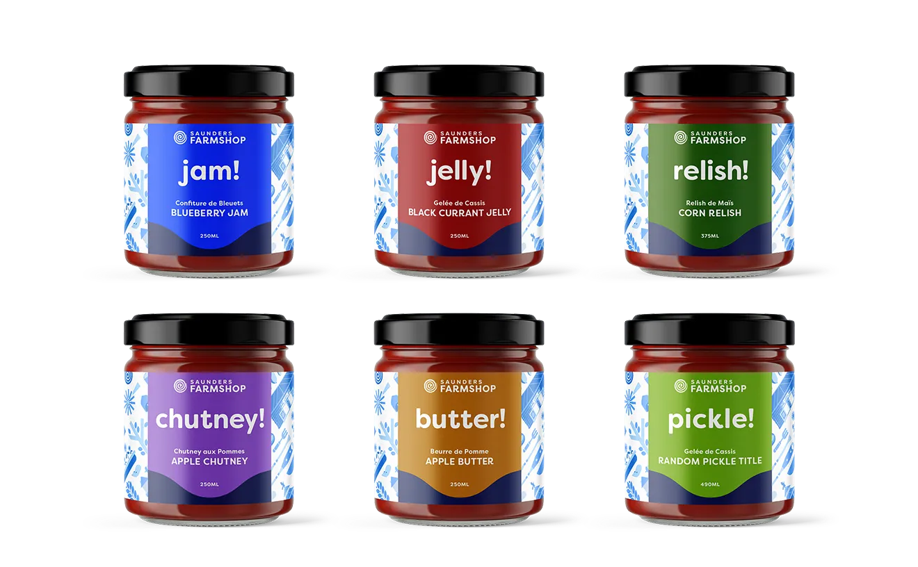
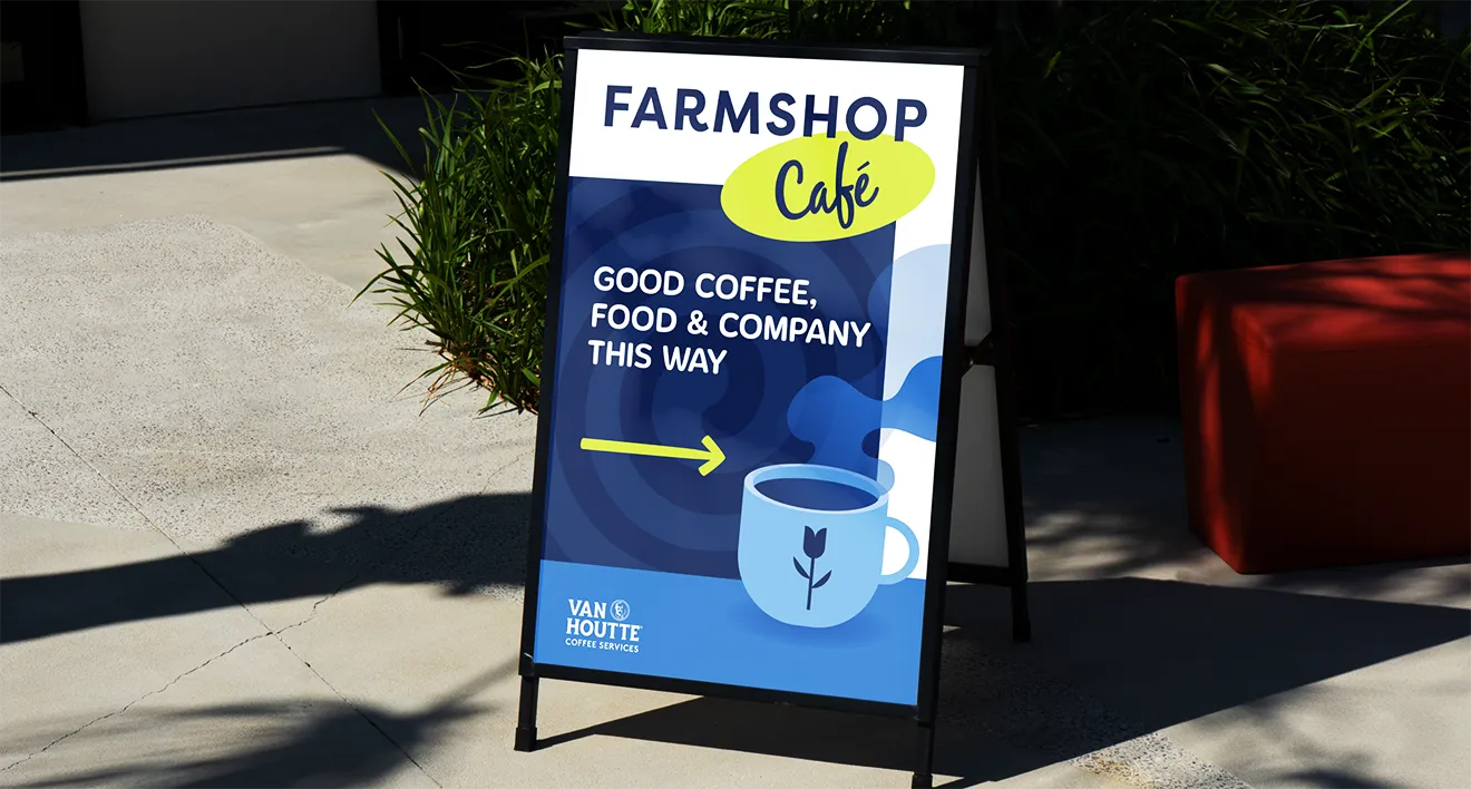
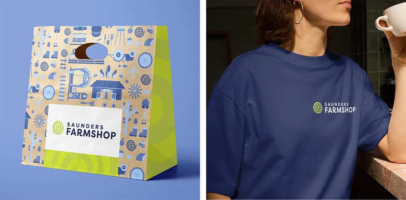
How we built a scalable retail Farmshop brand system to power a multitude of SKUs across Canada’s largest agri-tourism destination.
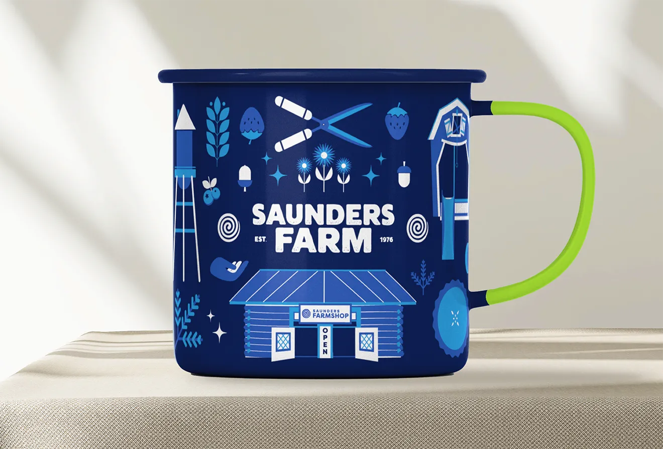
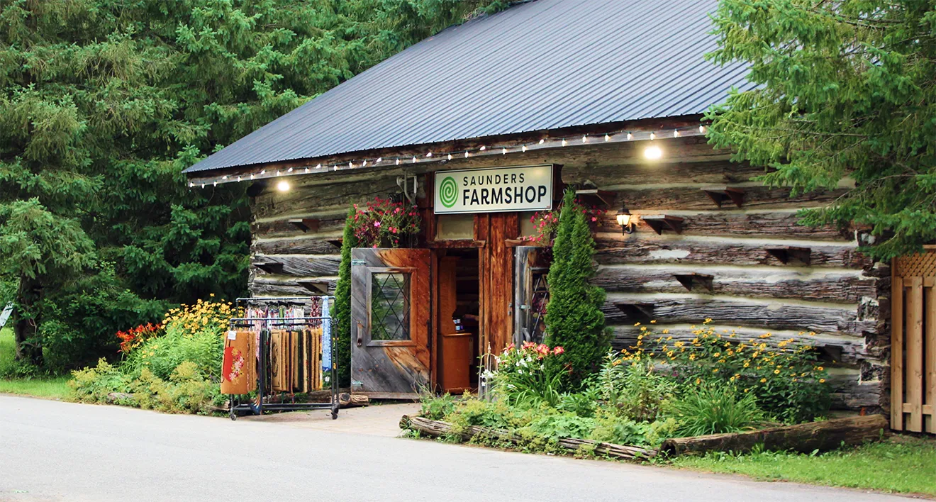
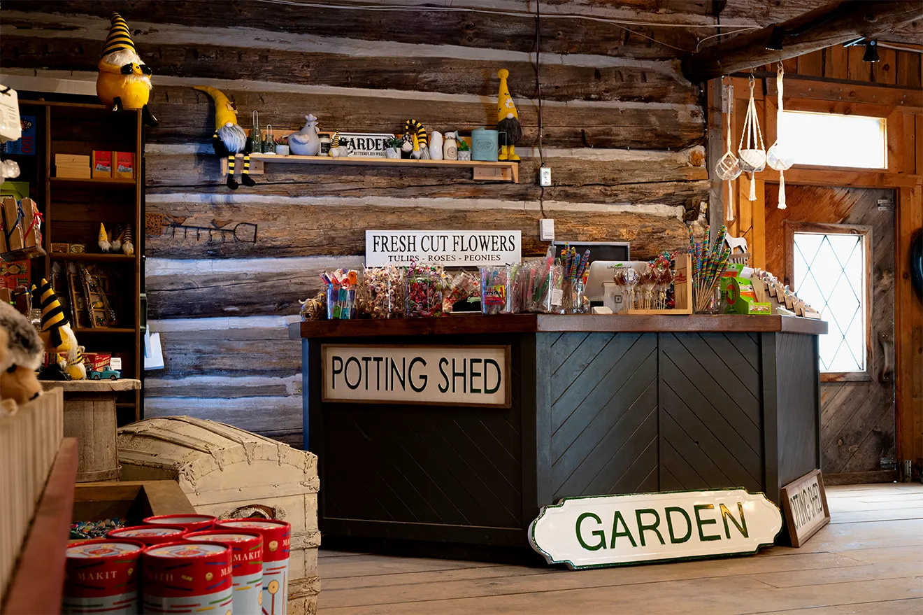
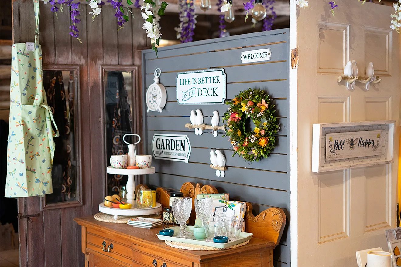
Saunders Farm needed to turn its retail store into a standalone brand experience that could grow beyond the farm itself. The challenge was creating a unique sub-brand that felt connected to Saunders Farm while avoiding the typical rustic farmhouse clichés or a generic corporate retail feel.
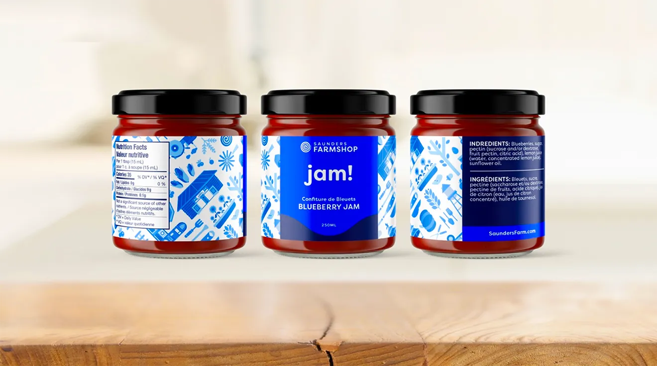
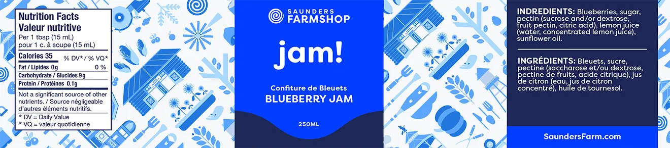
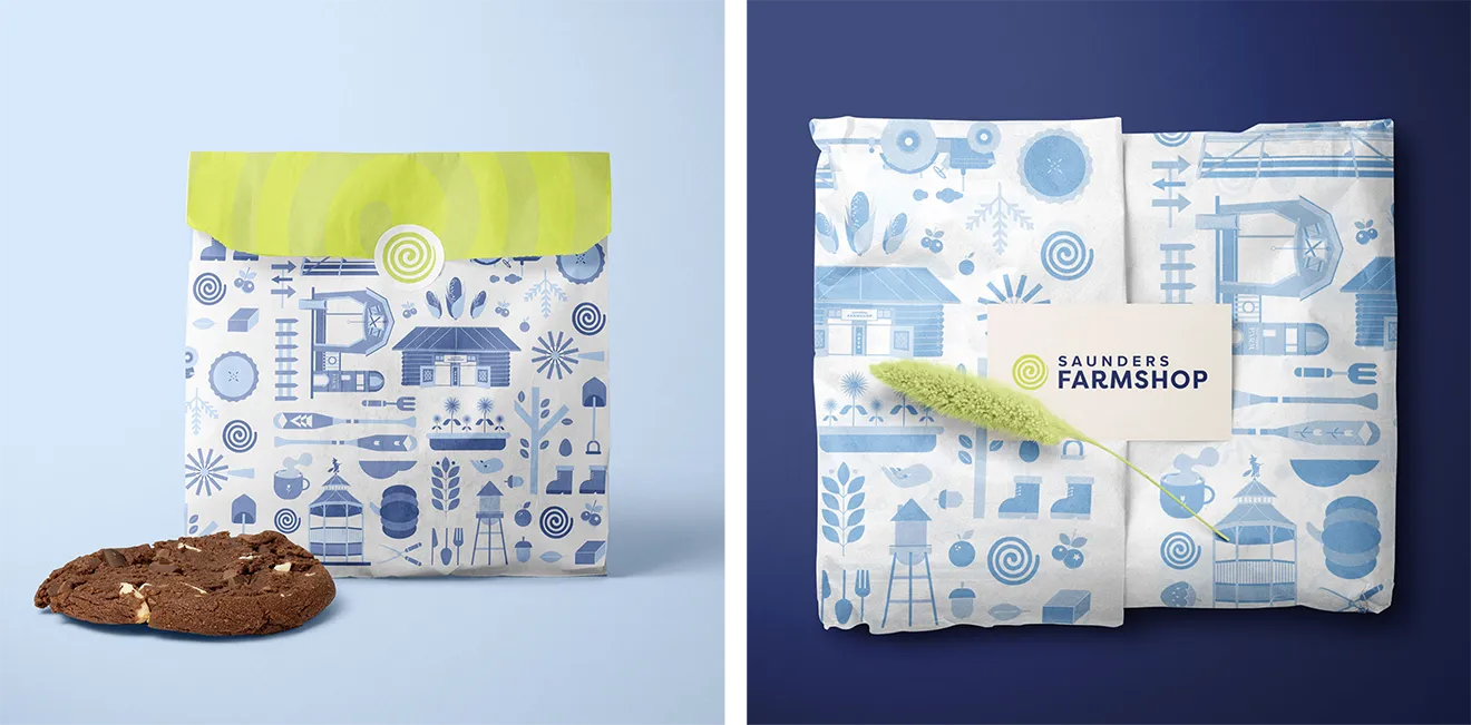
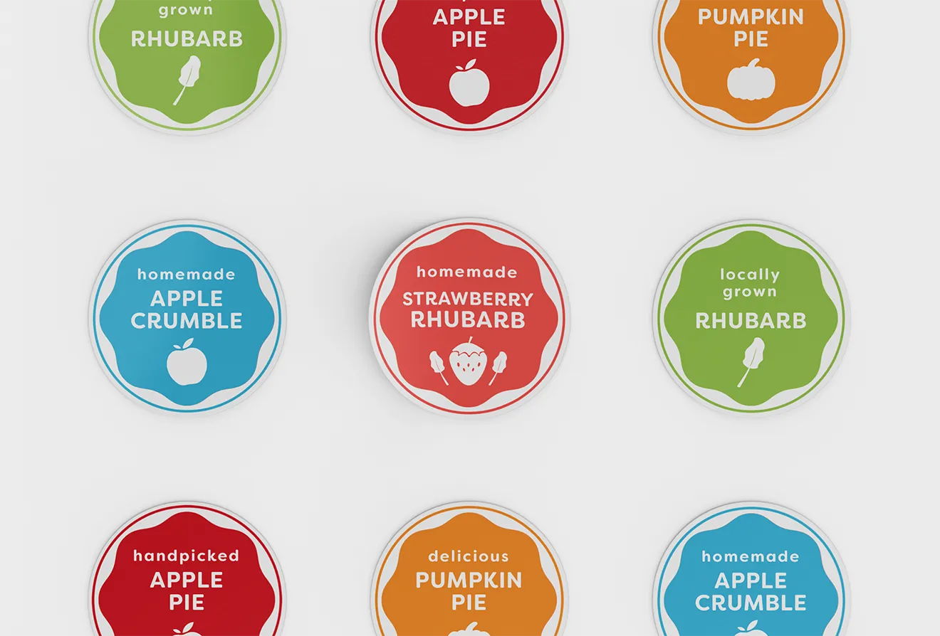
We built a scalable Farmshop brand system rooted in the Saunders Farm identity. Through custom illustrations, patterns, and thoughtful layouts, we created a flexible retail experience that could grow across everything from fresh bakery products to packaged farm goods. The result was a production ready packaging system designed for consistency, flexibility, and long term growth.
- Launched three integrated revenue streams across food, beverage, and experiential hospitality, turning the venue into a multi layered destination that goes way beyond traditional dining
- Designed 100% custom identity assets for every single guest touchpoint—from pizza boxes and wax paper to menus and on site signage—completely immersing guests in the brand
- Built the brand system around two recurring high traffic weekly event activations, driving consistent attendance and boosting engagement during midweek and off-peak patio hours
- Increased repeat visits by giving guests a reason to keep coming back through recurring programmed events and seasonal activations
- Elevated the overall perceived value of the dining experience through thoughtfully designed, cohesive hospitality touchpoints
- Sparked more social sharing and organic visibility by creating a highly distinctive, photo friendly environment guests actually want to post about
- Unified the entire guest experience across food, service, and space to remove friction and keep the brand feel totally consistent
- Positioned the Ciderhouse as a flagship experiential venue right at the heart of the Saunders Farm ecosystem
- Created a scalable hospitality framework designed to easily handle future event expansion and new seasonal programming
- Established a high trust brand presence in a newly emerging luxury travel and advocacy category
- Helped bring the brand from concept to life as a credible, beautifully positioned global identity
- Created a scalable iconography system that breaks down complex social themes into clear, visual stories
- Brought real visual cohesion across every digital touchpoint through hands on art direction and build oversight
- Built a flexible identity system that sets the brand up to scale effortlessly for long term growth
- Streamlined 14+ sub-brands and seasonal experiences into one unified, cohesive ecosystem
- Successfully launched 4 major seasonal sub-brands using our new modular framework
- Built a modular website system that made deploying seasonal events and content updates so much faster and way more developer friendly
- Redesigned our wayfinding and signage system to dramatically cut down visitor friction across the entire 100 acre site
- Transformed our maps and signage from basic navigation tools into intentional, high visibility touchpoints for the guest experience
- Rolled out a dual endorsement logo system that boosted off site recognition for newer sub brands by clearly separating on site and external marketing
- Introduced an event merchandise system across multiple seasonal experiences, opening up a brand new revenue stream and significantly boosting per event income
- Teamed up with Connect&GO to design custom ticketing and kiosk flows, creating a much smoother purchasing journey that helped drive higher point of sale conversions
- Delivered print ready, multi market packaging assets compliant with both U.S. and Canadian regulatory guidelines
- Integrated Halal certification across the product line, opening access to new consumer communities and retail opportunities
- Standardized production using a PMS colour systems, eliminating colour variation from CMYK print processes and ensuring consistent premium shelf appearance
- Created a scalable packaging framework that supports new flavour extensions without disrupting the core product lineup
- Strengthened overall brand consistency across both pouch and canned formats through a unified cross border design system
- Scaled from 1 to 12 SKUs, achieving a 1200% product line expansion within a unified visual system
- Successfully supported single entry into LCBO, grocery retail, and 30+ regional hospitality accounts across Ontario
- Enabled consistent rollout of seasonal and limited edition flavours without requiring redesign of the core system
- Strengthened shelf presence and brand recognition across high volume retail environments through consistent packaging architecture
- Supported distribution into rotating placements across bars, pubs, and restaurants throughout Ontario
- Contributed to increased brand visibility through integration into major regional events including the Ottawa Christmas Market and Ottawa Jazz Festival
- Helped establish MacIntosh’s Ciderhouse as a flagship on site destination experience anchoring the brand ecosystem
- Integrated cider production into a broader agritourism ecosystem, increasing exposure through festivals, hospitality, and on site visitation
- Delivered a 100% custom illustrative designed festival environment, built to maximize guest engagement across the full orchard landscape
- Successfully launched 6+ exclusive retail product lines, achieving strong sell out in sales during the inaugural event period
- Established the floral bloom experience as a standalone seasonal destination, reducing reliance on existing farm attractions
- Drove high levels of visitor generated content through shareable environmental branding installments
- Our design work generated consistent social media engagement, including Instagram stories, reels, and organic visitor tagging throughout the festival
- Achieved press coverage and media attention supporting the successful launch of the inaugural Tulipfest
- Created a fully branded spatial experience that extended the farm’s offering into a new seasonal revenue stream
- Established a scalable festival system that can support future seasonal expansion and annual iteration
- Enhanced sponsor and partner appeal through a highly cohesive, visually distinctive event environment
- Achieved +835% total revenue growth since the 2022 rebrand, including +513% growth in the first five months and sustained year over year expansion without heavy ad spend
- Scaled production from 4 core scents to a 16 SKU modular product line under a unified packaging system
- Successfully transitioned from Etsy and local markets into established wholesale and boutique retail channels
- Secured placement in premium retailers including Maker House Co. and Saunders Farmshop, validating retail readiness
- Shifted customer behaviour from generic home fragrance purchases to emotionally driven, collectible regional storytelling products
- Increased repeat gifting and tourism driven sales through narrative led product naming and positioning
- Established a scalable DTC + wholesale infrastructure through a custom Webflow e-commerce system
- Strengthened brand perception from craft maker to premium lifestyle candle brand within the regional retail ecosystem
- Increased organic word of mouth driven by memorable, place based product narratives
- 100% visual cohesion across 60+ SKUs of various baked goods products
- Extended the brand system into physical retail environments, including custom fridge and in-store display design for full environmental cohesion
- Increased perceived product premium-ness through unified packaging and consistent visual hierarchy across all goods
- 5+ years of ongoing system expansion and brand growth
- Multi category scalability spanning bakery, packaged goods, and retail merchandise
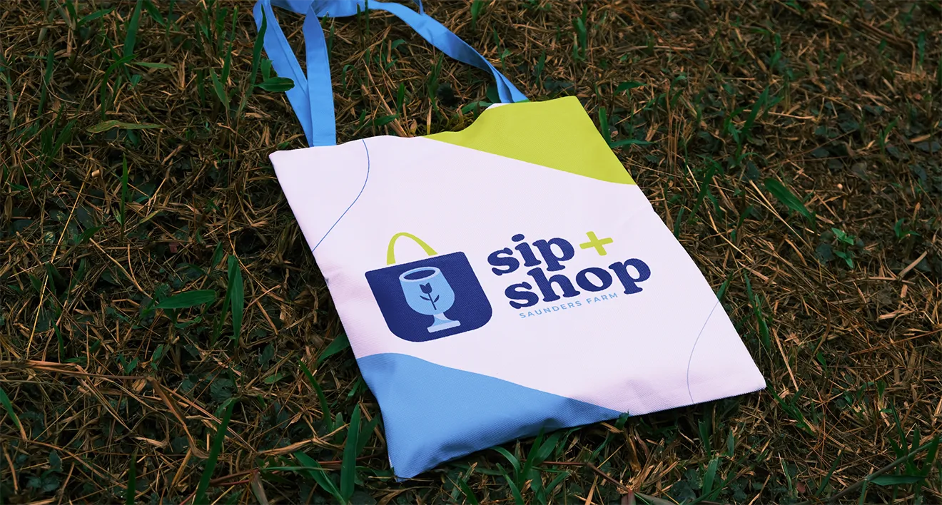
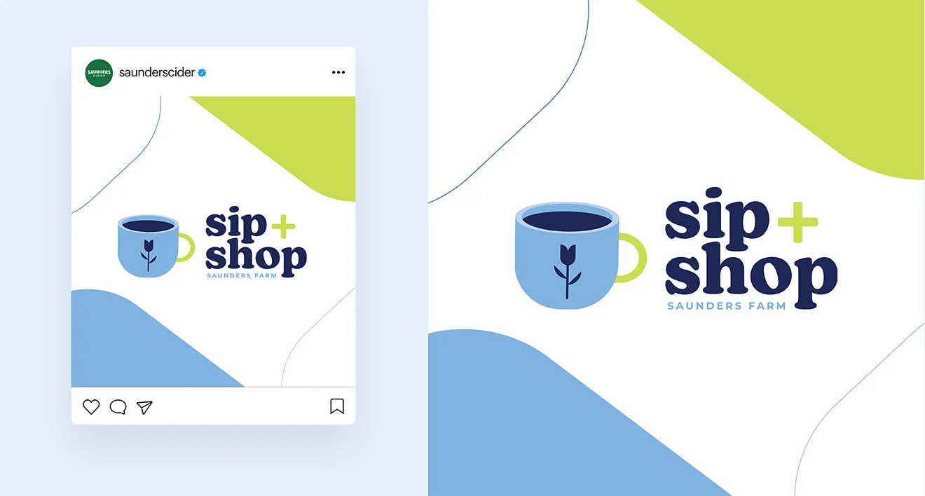
- Successful integration of sub brands (including Sip + Shop) into a unified retail ecosystem
- Improved retail merchandising flexibility while maintaining strict brand consistency across rotating SKUs
- Enhanced customer browsing experience through clearer product differentiation and organized category systems
- Built a recognizable brand presence in a crowded local trades market
- Helped the business appear more established and trustworthy from launch
- Created a cohesive visual system across apparel, print, and digital touchpoints
- Differentiated the company from generic contractor branding in the region
- Gave the founder a stronger sense of confidence and direction moving into business ownership
- Transitioned the brand from side project to the founder’s primary professional focus within 12 months of repositioning
- Expanded from online only sales into curated retail placements across boutiques in Ottawa and Quebec
- Eliminated third party marketplace fees through full migration to a custom e-commerce system, increasing revenue control
- Achieved consistent sell out performance across seasonal drops and regional market releases
- Strengthened brand perception, enabling higher-value pricing and improved customer alignment
- Successfully leveraged the refreshed identity to secure partnerships with major national grocers and high recognition wellness retailers, establishing the brand’s professional credibility
- The transition to the new design system supported a production upgrade, including the implementation of high volume labeling systems to meet increased regional demand
- Enabled expansion into specialized distribution channels across Ontario, supporting a total retail footprint of 100+ stores
- Resolved long standing consumer identification gaps by creating distinct visual categories, resulting in direct buyer feedback regarding improved shelf visibility and brand clarity
- Delivered a technical design framework that allowed the brand to maintain its core identity while navigating the competitive requirements of large scale retail negotiations
- Expanded distribution to 100+ retail locations across Eastern Ontario, breaking out of limited regional reach
- The rebrand secured placement across major grocery partners, independent wellness retailers, cafés, and restaurant accounts
- Their new rebrand built a strong wholesale network of +60 active accounts across the Ottawa to Kingston region
- The new packaging designs unlocked major commercial onboarding conversations with leading national grocery and healthy planet retail chains
- Earned international design recognition, with the project featured globally on Packaging of the World for excellence in CPG packaging design
- Achieved instant, widespread brand recognition, with customers explicitly identifying the signature Helping Hands illustration as Artizen’s unique stamp of quality
- Improved shelf clarity by transitioning to clear glass bottles, allowing product colour and quality to become a key selling point
- Significant increased DTC engagement at local specialty shops and farmers' markets due to the highly giftable, premium look of the new bottles
- Secured placement in 100+ retail locations across the Ottawa to Kingston region, including major grocers, cafés, and specialty retailers
- Drove strong wholesale performance, with consistent seasonal reorders of up to 50 case volumes per account during peak demand periods
- Eliminated cross category confusion at shelf, creating a clear visual distinction between kombucha and iced tea product lines
- Enabled successful entry into tea specific retail categories, expanding distribution opportunities beyond kombucha focused buyers
- Established the iced tea line as a gateway product, lowering retailer hesitation and supporting onboarding into the wider Artizen range
- Achieved international recognition in 2024 with a feature on Packaging of the World for CPG packaging design excellence
- Increased brand accessibility by introducing a lighter entry point for new customers unfamiliar with kombucha
- Strengthened overall portfolio clarity, improving how retailers and consumers navigated the expanded product system
- Merchandise sold out before the event, leading to a remarkable 290% increase in overall sales and turning the race brand into a highly profitable revenue stream
- Contributed to a significant revitalization of the event, with organizers reporting a smashing success in spectator and racer turnout
- Strengthened event recognition through a distinct, character led visual identity that stood out in a crowded local sports calendar
- Increased participant engagement by turning the race into a narrative driven experience rather than just a competitive event
- Elevated sponsor and community perception of the event, positioning it as a culturally relevant, design forward experience
- Created a scalable identity system that can be reused across future race editions, merch drops, and promotional campaigns
- Improved on the ground cohesion and wayfinding through consistent application across environmental graphics and race materials
- Expanded the event’s appeal beyond cyclists to include local community members and lifestyle audiences
- 410% increase in social following and community engagement following the rollout of the new visual system
- Subscription packaging redesign significantly increased organic user generated content (UGC) through enhanced unboxing appeal
- Established a distinctive illustration led brand style that became an industry reference point within the fly fishing niche
- Expanded brand system enabled growth into apparel, accessories, and digital content
- Long term organic discovery and inbound studio interest sustained through strong visual differentiation
- A strategic palette that ensures full usability for a colour blind owner without sacrificing market impact
- Successfully positioned the brand to mirror the aesthetic of local restaurants and hospitality clients they serve
- Delivered a modular social framework and brand guidelines that allow for rapid, consistent content creation from the shop floor
- Improved on site usability across fabrication, signage, and documentation systems due to simplified, structured visual hierarchy
- Enhanced operational efficiency by reducing ambiguity in colour based decision making for day to day use
- Revitalized a 70-year family legacy into a modern craft focused brand that aligns with the founder’s long term direction
- Earned direct recognition and outreach from global leadership with major industry players that validated the campaign’s visual and strategic impact
- Generated strong community engagement within the cannabis space, sparking peer to peer conversations around consumption and culture
- Elevated the campaign to align with the visual standards of leading CPG and cannabis brands
- Shifted audience perception of cannabis culture toward an educational, community driven narrative rather than product focused messaging
- Translated a complex social topic into a high impact digital campaign, demonstrating the effectiveness of illustration led storytelling
- Established a scalable social content system adaptable for future campaigns and seasonal activations
- Set a new visual benchmark for cannabis social content, balancing professional design standards with community advocacy
- Showcased the scalability of the brand through environmental graphics, proving how a local shop can command the same visual presence as a global franchise
- Created a super fun mural designs that serve a retail location into community destinations
- Demonstrated a sophisticated approach to Brand Evolution, maintaining the core identity that customers love while elevating the brand with illustrative design elements
- Strengthened brand differentiation in a saturated barbering market through a distinct neo-noir visual language
- Elevated customer perception from service based shop to curated experience and lifestyle brand
- Increased visual consistency across touchpoints through a unified system of illustration, typography, and layout rules
- Expanded brand application potential into merchandise and spatial design, not just in shop branding
- Established a flexible design system that can evolve with future locations or product extensions
- +100% Recyclability achieved through Terracycle program integration and eco friendly material specs
- Delivered a unified packaging system across multiple product formats (flower and oils)
- Reduced reliance on overtly clinical visual cues, improving perceived trust and accessibility for new users
- Established a scalable packaging structure that maintained compliance while allowing future product expansion
- Successfully leveraged as the primary technical portfolio piece to secure a position in the cannabis industry for internship
- Successfully transitioned into a reputable + globally recognized media and education powerhouse
- Improvement in user navigation and content engagement through optimized UI/UX architecture
- 100% Brand consistency achieved across multi channel sub domains via comprehensive style guidelines
- Improved speed of publishing new content through standardized templates
- Established a reusable design system for ongoing content production
- Improvement in user navigation and content engagement through optimized UI/UX architecture
- Executed a comprehensive brand asset refresh and website update for Trexity during a pivotal early transition phase from a local to a national platform
- Refined the core colour palette to align with WCAG 2.0 AAA accessibility standards, ensuring long term usability and high contrast across digital touch points
- Designed and delivered a scalable system of brand assets and website layouts, providing a structured framework that their team successfully built upon for future product iterations
- Created high fidelity digital assets and web designs designed to streamline communication for both local merchants and mobile delivery couriers
- Collaborated on a strategic creative pitch, delivering core visual concepts and brand guidelines that continue to influence their public facing identity today
- 100% Alignment with maintaining a distinct, approachable aesthetic
- Successfully Launched as a core product in Indiva’s portfolio, moving from a strategic vision to a physical, top performing retail item
- 95% Increase in visual standout by utilizing high contrast, bold first typographic design principles tailored for the 0.5 second retail glance
- Engineered a scalable brand architecture that allowed for seamless colour coding and flavour expansion across the entire Jewels product line
- Delivered a 100% plastic free packaging system using compostable materials, water based inks, and 96% ocean bound recycled components, fully aligning the physical product with its sustainability promise
- Unified three distinct sales channels—DTC, wholesale, and retail—into a single Shopify ecosystem to streamline operations into one scalable setup
- Simplified complex ingredient lists into clear, INCI-compliant messaging across packaging and digital touchpoints to make buying decisions effortless and transparent
- Built a cohesive, cross channel brand system across packaging, web, and social to strengthen consistency and recognition everywhere customers interact with the brand
- Positioned Goodlather right in that sweet spot between drugstore and luxury skincare, creating clear shelf differentiation and a scalable framework for national retail expansion
- Unified web, packaging, and social under one clear brand voice—stripping out the confusing skincare jargon to keep communication completely straightforward
- Strengthened brand credibility within the premium natural skincare space while keeping the brand warm and accessible for everyday users
- Designed a flexible packaging and brand system that lets the client roll out new SKUs and product lines with speed and ease
- Successfully repositioned the business from a retail furniture store into a custom fabrication studio
- Enabled full time transition into woodworking, with increased focus on custom commissions
- Secured placements of finished pieces in regional interior design and retail showrooms
- Expanded pipeline of custom furniture commissions following the rebrand and digital rollout
- CMS driven portfolio system allows continuous updating as new work is produced, supporting business growth in real time
- Revitalized a 70 year family legacy into a modern craft focused brand that aligns with the founder’s long term direction
- Brand Strategy
- Brand Positioning
- Creative Direction
- Accessibility
- Digital Identity System
- Webflow E-Commerce
- Copywriting Support
- SEO Foundations
- Web Assets & Maintenence
- Direction
- Brand Messaging
- Brand Refresh
- Graphic Design
- 2D Motion
- Direction
- Positioning
- E-Commerce
- Identity
- Illustration
- Package Design
- Web Design & Development
- Direction
- Brand Refresh
- Graphic Design
- Illustration
- Direction
- Brand Identity
- Brand Refresh
- Illustration
- Direction
- Brand Refresh
- Brand Guidelines
- Digital Design
- Identity
- Direction
- Merch & Apparel Design
- Brand Architecture
- Identity
- Environmental
- Illustration
- Direction
- Merch & Apparel Design
- Brand Architecture
- Identity
- Illustration
- Direction
- Package Design
- Identity
- Illustration
- Merch & Apparel Design
- Direction
- Brand Refresh
- Brand Guidelines
- Identity
- Web Design
- Direction
- Brand Identity
- Naming
- Print Collateral
- Direction
- Package Design
- Brand Refresh
- Identity
- Direction
- Apparel & Merch Design
- Brand Refresh
- Identity
- Illustration
- Direction
- Brand Identity
- Brand Refresh
- Package Design
- Illustration
- Branding
- Identity
- Illustration
- Direction
- Brand Architecture
- Package Design
- Brand Identity
- Positioning
- Naming
- Illustration
- Messaging
- Direction
- Brand Architecture
- Package Design
- Brand Identity
- Positioning
- Naming
- Illustration
- Messaging
- Direction
- Brand Guidelines
- Brand Identity
- Illustration
- Graphic Design
- Direction
- Brand Architecture
- Positioning
- Naming
- Identity
- Messaging
- Print Collateral
- Labels
- Direction
- Social Campaign
- Branding
- Illustration
- Social Media
- Direction
- E-Commerce
- Web Design
- Experience
- Identity
- Messaging
- Web Development
- Direction
- Brand Messaging
- Brand Refresh
- Graphic Design
- 2D Motion
- Direction
- Positioning
- E-Commerce
- Identity
- Illustration
- Package Design
- Web Design & Development
- Direction
- Brand Refresh
- Graphic Design
- Illustration
- Direction
- Brand Identity
- Brand Refresh
- Illustration
- Art Direction
- Brand Refresh
- Brand Guidelines
- Digital Design
- Accessibility Audit
- Wireframing
- Web Design
- Direction
- Merch & Apparel Design
- Brand Architecture
- Identity
- Environmental
- Illustration
- Direction
- Merch & Apparel Design
- Brand Architecture
- Identity
- Illustration
- Direction
- Package Design
- Identity
- Illustration
- Merch & Apparel Design
- Direction
- Brand Refresh
- Brand Guidelines
- Identity
- Web Design
- Direction
- Brand Identity
- Naming
- Print Collateral
- Direction
- Package Design
- Brand Refresh
- Identity
- Direction
- Apparel & Merch Design
- Brand Refresh
- Identity
- Illustration
- Direction
- Brand Identity
- Brand Refresh
- Package Design
- Illustration
- Branding
- Identity
- Illustration
- Direction
- Brand Architecture
- Package Design
- Brand Identity
- Positioning
- Naming
- Illustration
- Messaging
- Direction
- Brand Architecture
- Package Design
- Brand Identity
- Positioning
- Naming
- Illustration
- Messaging
- Direction
- Brand Guidelines
- Brand Identity
- Illustration
- Graphic Design
- Direction
- Brand Architecture
- Positioning
- Naming
- Identity
- Messaging
- Print Collateral
- Labels
- Direction
- Social Campaign
- Branding
- Illustration
- Social Media
- Direction
- E-Commerce
- Web Design
- Experience
- Identity
- Messaging
- Web Development
- Direction
- Brand Messaging
- Brand Refresh
- Graphic Design
- 2D Motion
- Creative Direction
- Brand Refresh
- Brand Identity
- Positioning
- Accessibility
- E-Commerce
- CPG Package Design
- Illustration
- Merch & Apparel
- Label Design
- Web Design & Development
- Print Production Management
- Direction
- Brand Refresh
- Graphic Design
- Illustration
- Direction
- Brand Identity
- Brand Refresh
- Illustration
- Direction
- Brand Refresh
- Brand Guidelines
- Digital Design
- Identity
- Direction
- Merch & Apparel Design
- Brand Architecture
- Identity
- Environmental
- Illustration
- Direction
- Merch & Apparel Design
- Brand Architecture
- Identity
- Illustration
- Direction
- Package Design
- Identity
- Illustration
- Merch & Apparel Design
- Direction
- Brand Refresh
- Brand Guidelines
- Identity
- Web Design
- Direction
- Brand Identity
- Naming
- Print Collateral
- Direction
- Package Design
- Brand Refresh
- Identity
- Direction
- Apparel & Merch Design
- Brand Refresh
- Identity
- Illustration
- Direction
- Brand Identity
- Brand Refresh
- Package Design
- Illustration
- Branding
- Identity
- Illustration
- Direction
- Brand Architecture
- Package Design
- Brand Identity
- Positioning
- Naming
- Illustration
- Messaging
- Direction
- Brand Architecture
- Package Design
- Brand Identity
- Positioning
- Naming
- Illustration
- Messaging
- Direction
- Brand Guidelines
- Brand Identity
- Illustration
- Graphic Design
- Direction
- Brand Architecture
- Positioning
- Naming
- Identity
- Messaging
- Print Collateral
- Labels
- Direction
- Social Campaign
- Branding
- Illustration
- Social Media
- Direction
- E-Commerce
- Web Design
- Experience
- Identity
- Messaging
- Web Development
- Direction
- Brand Messaging
- Brand Refresh
- Graphic Design
- 2D Motion
- Direction
- Positioning
- E-Commerce
- Identity
- Illustration
- Package Design
- Web Design & Development
- Direction
- Brand Refresh
- Graphic Design
- Illustration
- Direction
- Brand Refresh
- Visual Identity
- Illustration
- Concept Strategy
- Direction
- Brand Refresh
- Brand Guidelines
- Digital Design
- Identity
- Direction
- Merch & Apparel Design
- Brand Architecture
- Identity
- Environmental
- Illustration
- Direction
- Merch & Apparel Design
- Brand Architecture
- Identity
- Illustration
- Direction
- Package Design
- Identity
- Illustration
- Merch & Apparel Design
- Direction
- Brand Refresh
- Brand Guidelines
- Identity
- Web Design
- Direction
- Brand Identity
- Naming
- Print Collateral
- Direction
- Package Design
- Brand Refresh
- Identity
- Direction
- Apparel & Merch Design
- Brand Refresh
- Identity
- Illustration
- Direction
- Brand Identity
- Brand Refresh
- Package Design
- Illustration
- Branding
- Identity
- Illustration
- Direction
- Brand Architecture
- Package Design
- Brand Identity
- Positioning
- Naming
- Illustration
- Messaging
- Direction
- Brand Architecture
- Package Design
- Brand Identity
- Positioning
- Naming
- Illustration
- Messaging
- Direction
- Brand Guidelines
- Brand Identity
- Illustration
- Graphic Design
- Direction
- Brand Architecture
- Positioning
- Naming
- Identity
- Messaging
- Print Collateral
- Labels
- Direction
- Social Campaign
- Branding
- Illustration
- Social Media
- Direction
- E-Commerce
- Web Design
- Experience
- Identity
- Messaging
- Web Development
- Direction
- Brand Messaging
- Brand Refresh
- Graphic Design
- 2D Motion
- Direction
- Positioning
- E-Commerce
- Identity
- Illustration
- Package Design
- Web Design & Development
- Direction
- Brand Refinement
- Graphic Design
- Illustration
- Direction
- Brand Identity
- Brand Refresh
- Illustration
- Direction
- Brand Refresh
- Brand Guidelines
- Digital Design
- Identity
- Direction
- Merch & Apparel Design
- Brand Architecture
- Identity
- Environmental
- Illustration
- Direction
- Merch & Apparel Design
- Brand Architecture
- Identity
- Illustration
- Direction
- Package Design
- Identity
- Illustration
- Merch & Apparel Design
- Direction
- Brand Refresh
- Brand Guidelines
- Identity
- Web Design
- Direction
- Brand Identity
- Naming
- Print Collateral
- Direction
- Package Design
- Brand Refresh
- Identity
- Direction
- Apparel & Merch Design
- Brand Refresh
- Identity
- Illustration
- Direction
- Brand Identity
- Brand Refresh
- Package Design
- Illustration
- Branding
- Identity
- Illustration
- Direction
- Brand Architecture
- Package Design
- Brand Identity
- Positioning
- Naming
- Illustration
- Messaging
- Direction
- Brand Architecture
- Package Design
- Brand Identity
- Positioning
- Naming
- Illustration
- Messaging
- Direction
- Brand Guidelines
- Brand Identity
- Illustration
- Graphic Design
- Direction
- Brand Architecture
- Positioning
- Naming
- Identity
- Messaging
- Print Collateral
- Labels
- Direction
- Social Campaign
- Branding
- Illustration
- Social Media
- Creative Direction
- Brand Guidelines
- Brand Identity
- Iconography
- Webflow Website
- Brand Voice
- Social Media Assets
- Stationary
- Merch & Apparel
- Print Design
- Print Production Management
- Creative Direction
- Brand Guidelines
- Iconography
- Webflow Website Design
- Brand Voice
- Copywriting Support
- Social Assets
- Stationary & Print
- Creative Direction
- Illustration & Patterns
- Brand Strategy
- Brand Identity
- Signage
- Sub Branding
- CPG & Services Assets
- Glassware & Merch
- Social Media Templates
- Ui | UX
- Brand Guidelines
- Strategy
- Direction
- E-Commerce
- Web Design
- Experience
- Identity
- Messaging
- Web Development
- Direction
- Brand Messaging
- Brand Refresh
- Graphic Design
- 2D Motion
- Direction
- Positioning
- E-Commerce
- Identity
- Illustration
- Package Design
- Web Design & Development
- Direction
- Brand Refresh
- Graphic Design
- Illustration
- Direction
- Brand Identity
- Brand Refresh
- Illustration
- Direction
- Brand Refresh
- Brand Guidelines
- Digital Design
- Identity
- Direction
- Merch & Apparel Design
- Brand Architecture
- Identity
- Environmental
- Illustration
- Direction
- Merch & Apparel Design
- Brand Architecture
- Identity
- Illustration
- Direction
- Package Design
- Identity
- Illustration
- Merch & Apparel Design
- Direction
- Brand Refresh
- Brand Guidelines
- Identity
- Web Design
- Direction
- Brand Identity
- Naming
- Print Collateral
- Direction
- Package Design
- Brand Refresh
- Identity
- Direction
- Apparel & Merch Design
- Brand Refresh
- Identity
- Illustration
- Direction
- Brand Identity
- Brand Refresh
- Package Design
- Illustration
- Branding
- Identity
- Illustration
- Direction
- Brand Architecture
- Package Design
- Brand Identity
- Positioning
- Naming
- Illustration
- Messaging
- Direction
- Brand Architecture
- Package Design
- Brand Identity
- Positioning
- Naming
- Illustration
- Messaging
- Direction
- Brand Identity
- Brand Refresh
- Custom Iconography
- Brand Guidelines
- Merch
- Illustration
- Direction
- Brand Architecture
- Positioning
- Naming
- Identity
- Messaging
- Print Collateral
- Labels
- Direction
- Social Campaign
- Branding
- Illustration
- Social Media
- Maggie Buxton-Simpson
- Creative Direction
- Brand Guidelines
- Brand Identity
- Iconography
- Webflow Website
- Brand Voice
- Social Media Assets
- Stationary
- Merch & Apparel
- Print Design
- Print Production Management
- Creative Direction
- Brand Guidelines
- Brand Strategy
- Brand Identity
- Accessibility
- Social Media Templates
- Stationary & Print
- Creative Direction
- Illustration & Patterns
- Brand Strategy
- Brand Identity
- Signage
- Sub Branding
- CPG & Services Assets
- Glassware & Merch
- Social Media Templates
- Ui | UX
- Brand Guidelines
- Strategy
- Direction
- E-Commerce
- Web Design
- Experience
- Identity
- Messaging
- Web Development
- Direction
- Brand Messaging
- Brand Refresh
- Graphic Design
- 2D Motion
- Direction
- Positioning
- E-Commerce
- Identity
- Illustration
- Package Design
- Web Design & Development
- Direction
- Brand Refresh
- Graphic Design
- Illustration
- Direction
- Brand Identity
- Brand Refresh
- Illustration
- Direction
- Brand Refresh
- Brand Guidelines
- Digital Design
- Identity
- Direction
- Merch & Apparel Design
- Brand Architecture
- Identity
- Environmental
- Illustration
- Direction
- Merch & Apparel Design
- Brand Architecture
- Identity
- Illustration
- Direction
- Package Design
- Identity
- Illustration
- Merch & Apparel Design
- Direction
- Brand Refresh
- Brand Guidelines
- Identity
- Web Design
- Direction
- Brand Identity
- Naming
- Print Collateral
- Direction
- Package Design
- Brand Refresh
- Identity
- Direction
- Apparel & Merch Design
- Brand Refresh
- Identity
- Illustration
- Direction
- Brand Identity
- Brand Refresh
- Package Design
- Illustration
- Branding
- Identity
- Illustration
- Direction
- Brand Architecture
- Package Design
- Brand Identity
- Positioning
- Naming
- Illustration
- Messaging
- Direction
- Brand Architecture
- Package Design
- Brand Identity
- Positioning
- Naming
- Illustration
- Messaging
- Direction
- Brand Identity
- Brand Refresh
- Custom Iconography
- Brand Guidelines
- Merch
- Illustration
- Direction
- Brand Architecture
- Positioning
- Naming
- Identity
- Messaging
- Print Collateral
- Labels
- Direction
- Social Campaign
- Branding
- Illustration
- Social Media
- Maggie Buxton-Simpson
- Direction
- E-Commerce
- Web Design
- Experience
- Identity
- Messaging
- Web Development
- Direction
- Brand Messaging
- Brand Refresh
- Graphic Design
- 2D Motion
- Direction
- Positioning
- E-Commerce
- Identity
- Illustration
- Package Design
- Web Design & Development
- Direction
- Brand Refresh
- Graphic Design
- Illustration
- Direction
- Brand Identity
- Brand Refresh
- Illustration
- Direction
- Brand Refresh
- Brand Guidelines
- Digital Design
- Identity
- Direction
- Merch & Apparel Design
- Brand Architecture
- Identity
- Environmental
- Illustration
- Creative Direction
- Art Direction
- Brand Identity
- Brand Architecture
- Illustration
- Accessibility
- Merch & Apparel Design
- Environmental Design
- OOH Marketing Assets
- CPG Package Design
- Multi SKU Packaging
- Direction
- Package Design
- Identity
- Illustration
- Merch & Apparel Design
- Direction
- Brand Refresh
- Brand Guidelines
- Identity
- Web Design
- Direction
- Brand Identity
- Naming
- Print Collateral
- Direction
- Package Design
- Brand Refresh
- Identity
- Direction
- Apparel & Merch Design
- Brand Refresh
- Identity
- Illustration
- Direction
- Brand Identity
- Brand Refresh
- Package Design
- Illustration
- Branding
- Identity
- Illustration
- Direction
- Brand Architecture
- Package Design
- Brand Identity
- Positioning
- Naming
- Illustration
- Messaging
- Direction
- Brand Architecture
- Package Design
- Brand Identity
- Positioning
- Naming
- Illustration
- Messaging
- Direction
- Brand Guidelines
- Brand Identity
- Illustration
- Graphic Design
- Direction
- Brand Architecture
- Positioning
- Naming
- Identity
- Messaging
- Print Collateral
- Labels
- Direction
- Social Campaign
- Branding
- Illustration
- Social Media
- Direction
- E-Commerce
- Web Design
- Experience
- Identity
- Messaging
- Web Development
- Direction
- Brand Messaging
- Brand Refresh
- Graphic Design
- 2D Motion
- Direction
- Positioning
- E-Commerce
- Identity
- Illustration
- Package Design
- Web Design & Development
- Direction
- Brand Refresh
- Graphic Design
- Illustration
- Direction
- Brand Identity
- Brand Refresh
- Illustration
- Direction
- Brand Refresh
- Brand Guidelines
- Digital Design
- Identity
- Creative Direction
- Art Direction
- Sub Branding
- Brand Architecture
- Event Brand Identity
- Merch & Apparel
- Environmental Design
- Illustration
- Accessibility
- Print Design
- Print Production Management
- Banners & Flags
- Creative Direction
- Art Direction
- Sub Branding
- Brand Architecture
- Event Brand Identity
- Merch & Apparel
- Environmental Design
- Illutration
- Print Design
- Print Production Management
- Banners & Flags
- Direction
- Merch & Apparel Design
- Brand Architecture
- Identity
- Illustration
- Direction
- Package Design
- Identity
- Illustration
- Merch & Apparel Design
- Direction
- Brand Refresh
- Brand Guidelines
- Identity
- Web Design
- Direction
- Brand Identity
- Naming
- Print Collateral
- Direction
- Package Design
- Brand Refresh
- Identity
- Direction
- Apparel & Merch Design
- Brand Refresh
- Identity
- Illustration
- Direction
- Brand Identity
- Brand Refresh
- Package Design
- Illustration
- Branding
- Identity
- Illustration
- Direction
- Brand Architecture
- Package Design
- Brand Identity
- Positioning
- Naming
- Illustration
- Messaging
- Direction
- Brand Architecture
- Package Design
- Brand Identity
- Positioning
- Naming
- Illustration
- Messaging
- Direction
- Brand Guidelines
- Brand Identity
- Illustration
- Graphic Design
- Direction
- Brand Architecture
- Positioning
- Naming
- Identity
- Messaging
- Print Collateral
- Labels
- Direction
- Social Campaign
- Branding
- Illustration
- Social Media
- Creative Direction
- Art Direction
- Sub Branding
- Brand Architecture
- Event Brand Identity
- CPG Packaging Design
- Merch & Apparel
- Environmental Design
- Accessibility
- Illustration
- Print Design
- Print Production Management
- Banners & Flags
- Direction
- E-Commerce
- Web Design
- Experience
- Identity
- Messaging
- Web Development
- Direction
- Brand Messaging
- Brand Refresh
- Graphic Design
- 2D Motion
- Direction
- Positioning
- E-Commerce
- Identity
- Illustration
- Package Design
- Web Design & Development
- Direction
- Brand Refresh
- Graphic Design
- Illustration
- Direction
- Brand Identity
- Brand Refresh
- Illustration
- Direction
- Brand Refresh
- Brand Guidelines
- Digital Design
- Identity
- Creative Direction
- Art Direction
- Sub Branding
- Brand Architecture
- Event Brand Identity
- Merch & Apparel
- Environmental Design
- Illutration
- Print Design
- Print Production Management
- Banners & Flags
- Creative Direction
- Art Direction
- Sub Branding
- Brand Architecture
- Event Brand Identity
- Merch & Apparel
- Environmental Design
- Illutration
- Print Design
- Print Production Management
- Banners & Flags
- Direction
- Merch & Apparel Design
- Brand Architecture
- Identity
- Illustration
- Direction
- Package Design
- Identity
- Illustration
- Merch & Apparel Design
- Direction
- Brand Refresh
- Brand Guidelines
- Identity
- Web Design
- Direction
- Brand Identity
- Naming
- Print Collateral
- Direction
- Package Design
- Brand Refresh
- Identity
- Direction
- Apparel & Merch Design
- Brand Refresh
- Identity
- Illustration
- Direction
- Brand Identity
- Brand Refresh
- Package Design
- Illustration
- Branding
- Identity
- Illustration
- Direction
- Brand Architecture
- Package Design
- Brand Identity
- Positioning
- Naming
- Illustration
- Messaging
- Direction
- Brand Architecture
- Package Design
- Brand Identity
- Positioning
- Naming
- Illustration
- Messaging
- Direction
- Brand Guidelines
- Brand Identity
- Illustration
- Graphic Design
- Direction
- Brand Architecture
- Positioning
- Naming
- Identity
- Messaging
- Print Collateral
- Labels
- Direction
- Social Campaign
- Branding
- Illustration
- Social Media
- Creative Direction
- Art Direction
- Brand Strategy
- Accessibility
- Copywriting
- Naming
- Visual Identity
- Logo Design
- CPG Packaging Design
- Multi SKU Design
- Shopify E-Commerce
- SEO
- UX | UI
- Photography
- Brand Guidelines
- Social Media Design
- Social Media Strategy
- Direction
- E-Commerce
- Web Design
- Experience
- Identity
- Messaging
- Web Development
- Direction
- Brand Messaging
- Brand Refresh
- Graphic Design
- 2D Motion
- Direction
- Positioning
- E-Commerce
- Identity
- Illustration
- Package Design
- Web Design & Development
- Direction
- Brand Refresh
- Graphic Design
- Illustration
- Direction
- Brand Identity
- Brand Refresh
- Illustration
- Direction
- Brand Refresh
- Brand Guidelines
- Digital Design
- Identity
- Creative Direction
- Art Direction
- Sub Branding
- Brand Architecture
- Event Brand Identity
- Merch & Apparel
- Environmental Design
- Illutration
- Print Design
- Print Production Management
- Banners & Flags
- Direction
- Merch & Apparel Design
- Brand Architecture
- Identity
- Illustration
- Direction
- Package Design
- Identity
- Illustration
- Merch & Apparel Design
- Direction
- Brand Refresh
- Brand Guidelines
- Identity
- Web Design
- Direction
- Brand Identity
- Naming
- Print Collateral
- Direction
- Package Design
- Brand Refresh
- Identity
- Direction
- Apparel & Merch Design
- Brand Refresh
- Identity
- Illustration
- Direction
- Brand Identity
- Brand Refresh
- Package Design
- Illustration
- Branding
- Identity
- Illustration
- Direction
- Brand Architecture
- Package Design
- Brand Identity
- Positioning
- Naming
- Illustration
- Messaging
- Direction
- Brand Architecture
- Package Design
- Brand Identity
- Positioning
- Naming
- Illustration
- Messaging
- Direction
- Brand Guidelines
- Brand Identity
- Illustration
- Graphic Design
- Direction
- Brand Architecture
- Positioning
- Naming
- Identity
- Messaging
- Print Collateral
- Labels
- Direction
- Social Campaign
- Branding
- Illustration
- Social Media
- Creative Direction
- Art Direction
- Sub Branding
- Brand Architecture
- Event Brand Identity
- Merch & Apparel
- Environmental Design
- Illutration
- Print Design
- Print Production Management
- Banners & Flags
- Maggie Buxton-Simpson
- Direction
- E-Commerce
- Web Design
- Experience
- Identity
- Messaging
- Web Development
- Direction
- Brand Messaging
- Brand Refresh
- Graphic Design
- 2D Motion
- Direction
- Positioning
- E-Commerce
- Identity
- Illustration
- Package Design
- Web Design & Development
- Direction
- Brand Refresh
- Graphic Design
- Illustration
- Direction
- Brand Identity
- Brand Refresh
- Illustration
- Direction
- Brand Refresh
- Brand Guidelines
- Digital Design
- Identity
- Creative Direction
- Art Direction
- Sub Branding
- Brand Architecture
- Event Brand Identity
- Merch & Apparel
- Environmental Design
- Illutration
- Print Design
- Print Production Management
- Banners & Flags
- Direction
- Merch & Apparel Design
- Brand Architecture
- Identity
- Illustration
- Direction
- Package Design
- Identity
- Illustration
- Merch & Apparel Design
- Direction
- Brand Refresh
- Brand Guidelines
- Identity
- Web Design
- Direction
- Brand Identity
- Naming
- Print Collateral
- Direction
- Package Design
- Brand Refresh
- Identity
- Direction
- Apparel & Merch Design
- Brand Refresh
- Identity
- Illustration
- Direction
- Brand Identity
- Brand Refresh
- Package Design
- Illustration
- Branding
- Identity
- Illustration
- Branding
- Identity
- Illustration
- Direction
- Brand Architecture
- Package Design
- Brand Identity
- Positioning
- Naming
- Illustration
- Messaging
- Direction
- Brand Architecture
- Package Design
- Brand Identity
- Positioning
- Naming
- Illustration
- Messaging
- Direction
- Brand Guidelines
- Brand Identity
- Illustration
- Graphic Design
- Direction
- Brand Architecture
- Positioning
- Naming
- Identity
- Messaging
- Print Collateral
- Labels
- Direction
- Social Campaign
- Branding
- Illustration
- Social Media
- Direction
- E-Commerce
- Web Design
- Experience
- Identity
- Messaging
- Web Development
- Direction
- Brand Messaging
- Brand Refresh
- Graphic Design
- 2D Motion
- Direction
- Positioning
- E-Commerce
- Identity
- Illustration
- Package Design
- Web Design & Development
- Direction
- Brand Refresh
- Graphic Design
- Illustration
- Direction
- Brand Identity
- Brand Refresh
- Illustration
- Direction
- Brand Refresh
- Brand Guidelines
- Digital Design
- Identity
- Direction
- Merch & Apparel Design
- Brand Architecture
- Identity
- Environmental
- Illustration
- Direction
- Merch & Apparel Design
- Brand Architecture
- Identity
- Illustration
- Direction
- Package Design
- Identity
- Illustration
- Merch & Apparel Design
- Art Direction
- Brand Refresh
- Brand Guidelines
- Brand Strategy
- Visual Identity
- Accessibility
- Logo Design
- Ui | UX Design
- Merch & Apparel
- Web Design
- Direction
- Brand Identity
- Naming
- Print Collateral
- Direction
- Package Design
- Brand Refresh
- Identity
- Direction
- Apparel & Merch Design
- Brand Refresh
- Identity
- Illustration
- Direction
- Brand Identity
- Brand Refresh
- Package Design
- Illustration
- Branding
- Identity
- Illustration
- Direction
- Brand Architecture
- Package Design
- Brand Identity
- Positioning
- Naming
- Illustration
- Messaging
- Direction
- Brand Architecture
- Package Design
- Brand Identity
- Positioning
- Naming
- Illustration
- Messaging
- Direction
- Brand Guidelines
- Brand Identity
- Illustration
- Graphic Design
- Direction
- Brand Architecture
- Positioning
- Naming
- Identity
- Messaging
- Print Collateral
- Labels
- Direction
- Social Campaign
- Branding
- Illustration
- Social Media
- Direction
- E-Commerce
- Web Design
- Experience
- Identity
- Messaging
- Web Development
- Direction
- Brand Messaging
- Brand Refresh
- Graphic Design
- 2D Motion
- Direction
- Brand Messaging
- Brand Refresh
- Graphic Design
- 2D Motion
- Direction
- Positioning
- E-Commerce
- Identity
- Illustration
- Package Design
- Web Design & Development
- Direction
- Brand Refresh
- Graphic Design
- Illustration
- Direction
- Brand Identity
- Brand Refresh
- Illustration
- Direction
- Brand Refresh
- Brand Guidelines
- Digital Design
- Identity
- Direction
- Merch & Apparel Design
- Brand Architecture
- Identity
- Environmental
- Illustration
- Direction
- Merch & Apparel Design
- Brand Architecture
- Identity
- Illustration
- Direction
- Package Design
- Identity
- Illustration
- Merch & Apparel Design
- Art Direction
- Brand Refresh
- Brand Guidelines
- Brand Strategy
- Visual Identity
- Logo Design
- Ui | UX Design
- Merch & Apparel
- Web Design
- Creative Direction
- Brand Identity
- Logo Variations
- Custom Icons
- Accessibility
- Supporting Graphics
- Business Cards
- Merch Concepts
- Brand Guidelines
- Direction
- Package Design
- Brand Refresh
- Identity
- Direction
- Apparel & Merch Design
- Brand Refresh
- Identity
- Illustration
- Direction
- Brand Identity
- Brand Refresh
- Package Design
- Illustration
- Branding
- Identity
- Illustration
- Direction
- Brand Architecture
- Package Design
- Brand Identity
- Positioning
- Naming
- Illustration
- Messaging
- Direction
- Brand Architecture
- Package Design
- Brand Identity
- Positioning
- Naming
- Illustration
- Messaging
- Direction
- Brand Guidelines
- Brand Identity
- Illustration
- Graphic Design
- Direction
- Brand Architecture
- Positioning
- Naming
- Identity
- Messaging
- Print Collateral
- Labels
- Direction
- Social Campaign
- Branding
- Illustration
- Social Media
- Direction
- E-Commerce
- Web Design
- Experience
- Identity
- Messaging
- Web Development
- Direction
- Brand Messaging
- Brand Refresh
- Graphic Design
- 2D Motion
- Direction
- Positioning
- E-Commerce
- Identity
- Illustration
- Package Design
- Web Design & Development
- Direction
- Brand Refresh
- Graphic Design
- Illustration
- Direction
- Brand Identity
- Brand Refresh
- Illustration
- Direction
- Brand Refresh
- Brand Guidelines
- Digital Design
- Identity
- Direction
- Merch & Apparel Design
- Brand Architecture
- Identity
- Environmental
- Illustration
- Direction
- Merch & Apparel Design
- Brand Architecture
- Identity
- Illustration
- Creative Direction
- CPG Label Design
- CPG Visual System
- Multi SKU Design
- Illustration
- Naming
- Brand Identity
- Accessibility
- Logo Suites
- OOH Ads
- Vehicle Wraps
- Event Branding
- Seasonal Packaging Design
- Merch & Apparel
- Direction
- Brand Refresh
- Brand Guidelines
- Identity
- Web Design
- Direction
- Brand Identity
- Naming
- Print Collateral
- Direction
- Package Design
- Brand Refresh
- Identity
- Direction
- Apparel & Merch Design
- Brand Refresh
- Identity
- Illustration
- Direction
- Brand Identity
- Brand Refresh
- Package Design
- Illustration
- Branding
- Identity
- Illustration
- Direction
- Brand Architecture
- Package Design
- Brand Identity
- Positioning
- Naming
- Illustration
- Messaging
- Direction
- Brand Architecture
- Package Design
- Brand Identity
- Positioning
- Naming
- Illustration
- Messaging
- Direction
- Brand Guidelines
- Brand Identity
- Illustration
- Graphic Design
- Direction
- Brand Architecture
- Positioning
- Naming
- Identity
- Messaging
- Print Collateral
- Labels
- Direction
- Social Campaign
- Branding
- Illustration
- Social Media
- Direction
- E-Commerce
- Web Design
- Experience
- Identity
- Messaging
- Web Development
- Direction
- Brand Messaging
- Brand Refresh
- Graphic Design
- 2D Motion
- Direction
- Positioning
- E-Commerce
- Identity
- Illustration
- Package Design
- Web Design & Development
- Direction
- Brand Refresh
- Graphic Design
- Illustration
- Direction
- Brand Identity
- Brand Refresh
- Illustration
- Direction
- Brand Refresh
- Brand Guidelines
- Digital Design
- Identity
- Creative Direction
- Brand Identity
- Brand Architecture
- Sub Brand System
- Wayfinding
- Web Design
- Accessibility
- Kiosk Design Support
- Environmental Signage
- Illustration
- Brand Guidelines
- OOH Marketing Materials
- Banners & Flags
- CPG Packaging Design
- Direction
- Merch & Apparel Design
- Brand Architecture
- Identity
- Illustration
- Creative Direction
- CPG Label Design
- CPG Visual System
- Illustration
- Naming
- Brand Identity
- Logo Suites
- OOH Ads
- Vehicle Wraps
- Event Branding
- Seasonal Packaging Design
- Merch & Apparel
- Direction
- Brand Refresh
- Brand Guidelines
- Identity
- Web Design
- Direction
- Brand Identity
- Naming
- Print Collateral
- Direction
- Package Design
- Brand Refresh
- Identity
- Direction
- Apparel & Merch Design
- Brand Refresh
- Identity
- Illustration
- Direction
- Brand Identity
- Brand Refresh
- Package Design
- Illustration
- Branding
- Identity
- Illustration
- Direction
- Brand Architecture
- Package Design
- Brand Identity
- Positioning
- Naming
- Illustration
- Messaging
- Direction
- Brand Architecture
- Package Design
- Brand Identity
- Positioning
- Naming
- Illustration
- Messaging
- Direction
- Brand Guidelines
- Brand Identity
- Illustration
- Graphic Design
- Direction
- Brand Architecture
- Positioning
- Naming
- Identity
- Messaging
- Print Collateral
- Labels
- Direction
- Social Campaign
- Branding
- Illustration
- Social Media
- Direction
- E-Commerce
- Web Design
- Experience
- Identity
- Messaging
- Web Development
- Direction
- Brand Messaging
- Brand Refresh
- Graphic Design
- 2D Motion
- Direction
- Positioning
- E-Commerce
- Identity
- Illustration
- Package Design
- Web Design & Development
- Direction
- Brand Refresh
- Graphic Design
- Illustration
- Direction
- Brand Identity
- Brand Refresh
- Illustration
- Direction
- Brand Refresh
- Brand Guidelines
- Digital Design
- Identity
- Creative Direction
- Brand Identity
- Brand Architecture
- Sub Brand System
- Wayfinding
- Web Design
- Kiosk Design Support
- Environmental Signage
- Illustration
- Brand Guidelines
- OOH Marketing Materials
- Banners & Flags
- CPG Packaging Design
- Direction
- Merch & Apparel Design
- Brand Architecture
- Identity
- Illustration
- Creative Direction
- CPG Label Design
- CPG Visual System
- Illustration
- Naming
- Brand Identity
- Logo Suites
- OOH Ads
- Vehicle Wraps
- Event Branding
- Seasonal Packaging Design
- Merch & Apparel
- Direction
- Brand Refresh
- Brand Guidelines
- Identity
- Web Design
- Direction
- Brand Identity
- Naming
- Print Collateral
- Direction
- Package Design
- Brand Refresh
- Identity
- Direction
- Apparel & Merch Design
- Brand Refresh
- Identity
- Illustration
- Direction
- Brand Identity
- Brand Refresh
- Package Design
- Illustration
- Branding
- Identity
- Illustration
- Direction
- Brand Architecture
- Package Design
- Brand Identity
- Positioning
- Naming
- Illustration
- Messaging
- Creative Direction
- Naming
- Rebranding
- Accessibility
- Sub Branding
- Brand Identity
- Brand Positioning
- CPG Label Design
- CPG Visual System
- CPG Seasonal Designs
- Brand Marketing Assets
- Print Production Management
- Direction
- Brand Guidelines
- Brand Identity
- Illustration
- Graphic Design
- Direction
- Brand Architecture
- Positioning
- Naming
- Identity
- Messaging
- Print Collateral
- Labels
- Direction
- Social Campaign
- Branding
- Illustration
- Social Media
- Direction
- E-Commerce
- Web Design
- Experience
- Identity
- Messaging
- Web Development
- Direction
- Brand Messaging
- Brand Refresh
- Graphic Design
- 2D Motion
- Direction
- Positioning
- E-Commerce
- Identity
- Illustration
- Package Design
- Web Design & Development
- Direction
- Brand Refresh
- Graphic Design
- Illustration
- Direction
- Brand Identity
- Brand Refresh
- Illustration
- Direction
- Brand Refresh
- Brand Guidelines
- Digital Design
- Identity
- Creative Direction
- Brand Identity
- Brand Architecture
- Sub Brand System
- Wayfinding
- Web Design
- Kiosk Design Support
- Environmental Signage
- Illustration
- Brand Guidelines
- OOH Marketing Materials
- Banners & Flags
- CPG Packaging Design
- Direction
- Merch & Apparel Design
- Brand Architecture
- Identity
- Illustration
- Creative Direction
- CPG Label Design
- CPG Visual System
- Illustration
- Naming
- Brand Identity
- Logo Suites
- OOH Ads
- Vehicle Wraps
- Event Branding
- Seasonal Packaging Design
- Merch & Apparel
- Direction
- Brand Refresh
- Brand Guidelines
- Identity
- Web Design
- Direction
- Brand Identity
- Naming
- Print Collateral
- Direction
- Package Design
- Brand Refresh
- Identity
- Direction
- Apparel & Merch Design
- Brand Refresh
- Identity
- Illustration
- Direction
- Brand Identity
- Brand Refresh
- Package Design
- Illustration
- Branding
- Identity
- Illustration
- Direction
- Brand Architecture
- Package Design
- Brand Identity
- Positioning
- Naming
- Illustration
- Messaging
- Creative Direction
- Naming
- Rebranding
- Sub Branding
- Brand Identity
- Brand Positioning
- CPG Label Design
- CPG Visual System
- CPG Seasonal Designs
- Brand Marketing Assets
- Print Production Management
- Art Direction
- Brand Refresh
- Brand Refresh
- Brand Guidelines
- Brand Identity
- Accessibility
- Illustration
- Iconography
- Direction
- Brand Architecture
- Positioning
- Naming
- Identity
- Messaging
- Print Collateral
- Labels
- Direction
- Social Campaign
- Branding
- Illustration
- Social Media
- CPG Label Designs
- New SKU Integration
- Technical Production
- Certification Compliance
- PMS Colour Adjustments
- USA & Canadian Compliance Updates
- Direction
- E-Commerce
- Web Design
- Experience
- Identity
- Messaging
- Web Development
- Direction
- Brand Messaging
- Brand Refresh
- Graphic Design
- 2D Motion
- Direction
- Positioning
- E-Commerce
- Identity
- Illustration
- Package Design
- Web Design & Development
- Direction
- Brand Refresh
- Graphic Design
- Illustration
- Direction
- Brand Identity
- Brand Refresh
- Illustration
- Direction
- Brand Refresh
- Brand Guidelines
- Digital Design
- Identity
- Direction
- Merch & Apparel Design
- Brand Architecture
- Identity
- Environmental
- Illustration
- Direction
- Merch & Apparel Design
- Brand Architecture
- Identity
- Illustration
- Creative Direction
- CPG Label Design
- CPG Visual System
- Illustration
- Naming
- Brand Identity
- Logo Suites
- OOH Ads
- Vehicle Wraps
- Event Branding
- Seasonal Packaging Design
- Merch & Apparel
- Direction
- Brand Refresh
- Brand Guidelines
- Identity
- Web Design
- Direction
- Brand Identity
- Naming
- Print Collateral
- Direction
- Package Design
- Brand Refresh
- Identity
- Direction
- Apparel & Merch Design
- Brand Refresh
- Identity
- Illustration
- Direction
- Brand Identity
- Brand Refresh
- Package Design
- Illustration
- Branding
- Identity
- Illustration
- Direction
- Brand Architecture
- Package Design
- Brand Identity
- Positioning
- Naming
- Illustration
- Messaging
- Direction
- Brand Architecture
- Package Design
- Brand Identity
- Positioning
- Naming
- Illustration
- Messaging
- Direction
- Brand Guidelines
- Brand Identity
- Illustration
- Graphic Design
- Direction
- Brand Architecture
- Positioning
- Naming
- Identity
- Messaging
- Print Collateral
- Labels
- Direction
- Social Campaign
- Branding
- Illustration
- Social Media
- Direction
- E-Commerce
- Web Design
- Experience
- Identity
- Messaging
- Web Development
- Art Direction
- Logo Design
- Visual Identity
- Brand Refresh
- Direction
- Positioning
- E-Commerce
- Identity
- Illustration
- Package Design
- Web Design & Development
- Direction
- Brand Refresh
- Graphic Design
- Illustration
- Direction
- Brand Identity
- Brand Refresh
- Illustration
- Direction
- Brand Refresh
- Brand Guidelines
- Digital Design
- Identity
- Direction
- Merch & Apparel Design
- Brand Architecture
- Identity
- Environmental
- Illustration
- Direction
- Merch & Apparel Design
- Brand Architecture
- Identity
- Illustration
- Direction
- Package Design
- Identity
- Illustration
- Merch & Apparel Design
- Direction
- Brand Refresh
- Brand Guidelines
- Identity
- Web Design
- Direction
- Brand Identity
- Naming
- Print Collateral
- Direction
- Package Design
- Brand Refresh
- Identity
- Direction
- Apparel & Merch Design
- Brand Refresh
- Identity
- Illustration
- Direction
- Brand Identity
- Brand Refresh
- Package Design
- Illustration
- Branding
- Identity
- Illustration
- Direction
- Brand Architecture
- Package Design
- Brand Identity
- Positioning
- Naming
- Illustration
- Messaging
- Direction
- Brand Architecture
- Package Design
- Brand Identity
- Positioning
- Naming
- Illustration
- Messaging
- Direction
- Brand Guidelines
- Brand Identity
- Illustration
- Graphic Design
- Direction
- Brand Architecture
- Positioning
- Naming
- Identity
- Messaging
- Print Collateral
- Labels
- Direction
- Social Campaign
- Branding
- Illustration
- Social Media
- CPG Label Designs
- New SKU Integration
- Technical Production
- Certification Compliance
- PMS Colour Adjustments
- USA & Canadian Compliance Updates
- Direction
- E-Commerce
- Web Design
- Experience
- Identity
- Messaging
- Web Development
- Direction
- Brand Messaging
- Brand Refresh
- Graphic Design
- 2D Motion
- Direction
- Positioning
- E-Commerce
- Identity
- Illustration
- Package Design
- Web Design & Development
- Direction
- Brand Refresh
- Graphic Design
- Illustration
- Direction
- Brand Identity
- Brand Refresh
- Illustration
- Direction
- Brand Refresh
- Brand Guidelines
- Digital Design
- Identity
- Direction
- Merch & Apparel Design
- Brand Architecture
- Identity
- Environmental
- Illustration
- Direction
- Merch & Apparel Design
- Brand Architecture
- Identity
- Illustration
- Direction
- Package Design
- Identity
- Illustration
- Merch & Apparel Design
- Direction
- Brand Refresh
- Brand Guidelines
- Identity
- Web Design
- Direction
- Brand Identity
- Naming
- Print Collateral
- Direction
- Package Design
- Brand Refresh
- Identity
- Direction
- Apparel & Merch Design
- Brand Refresh
- Identity
- Illustration
- Direction
- Brand Identity
- Brand Refresh
- Package Design
- Illustration
- CPG Label Designs
- New SKU Integration
- Technical Production
- Certification Compliance
- PMS Standardization
- USA & Canadian Compliance Updates
- Direction
- Brand Architecture
- Package Design
- Brand Identity
- Positioning
- Naming
- Illustration
- Messaging
- Direction
- Brand Architecture
- Package Design
- Brand Identity
- Positioning
- Naming
- Illustration
- Messaging
- Direction
- Brand Guidelines
- Brand Identity
- Illustration
- Graphic Design
- Direction
- Brand Architecture
- Positioning
- Naming
- Identity
- Messaging
- Print Collateral
- Labels
- Direction
- Social Campaign
- Branding
- Illustration
- Social Media
- Direction
- E-Commerce
- Web Design
- Experience
- Identity
- Messaging
- Web Development
- Direction
- Brand Messaging
- Brand Refresh
- Graphic Design
- 2D Motion
- Direction
- Positioning
- E-Commerce
- Identity
- Illustration
- Package Design
- Web Design & Development
- Direction
- Brand Refresh
- Graphic Design
- Illustration
- Direction
- Brand Identity
- Brand Refresh
- Illustration
- Direction
- Brand Refresh
- Brand Guidelines
- Digital Design
- Identity
- Direction
- Merch & Apparel Design
- Brand Architecture
- Identity
- Environmental
- Illustration
- Direction
- Merch & Apparel Design
- Brand Architecture
- Identity
- Illustration
- Direction
- Package Design
- Identity
- Illustration
- Merch & Apparel Design
- Direction
- Brand Refresh
- Brand Guidelines
- Identity
- Web Design
- Direction
- Brand Identity
- Naming
- Print Collateral
- Direction
- Package Design
- Brand Refresh
- Identity
- Direction
- Apparel & Merch Design
- Brand Refresh
- Identity
- Illustration
- Direction
- Visual Assets
- CPG Packaging Design
- Brand Identity
- Brand Refresh
- Merch
- Illustration
- Branding
- Identity
- Illustration
- Direction
- Brand Architecture
- Package Design
- Brand Identity
- Positioning
- Naming
- Illustration
- Messaging
- Direction
- Brand Architecture
- Package Design
- Brand Identity
- Positioning
- Naming
- Illustration
- Messaging
- Direction
- Brand Guidelines
- Brand Identity
- Illustration
- Graphic Design
- Direction
- Brand Architecture
- Positioning
- Naming
- Identity
- Messaging
- Print Collateral
- Labels
- Direction
- Social Campaign
- Branding
- Illustration
- Social Media
- Direction
- E-Commerce
- Web Design
- Experience
- Identity
- Messaging
- Web Development
- Direction
- Brand Messaging
- Brand Refresh
- Graphic Design
- 2D Motion
- Direction
- Positioning
- E-Commerce
- Identity
- Illustration
- Package Design
- Web Design & Development
- Direction
- Brand Refresh
- Graphic Design
- Illustration
- Direction
- Brand Identity
- Brand Refresh
- Illustration
- Direction
- Brand Refresh
- Brand Guidelines
- Digital Design
- Identity
- Direction
- Merch & Apparel Design
- Brand Architecture
- Identity
- Environmental
- Illustration
- Direction
- Merch & Apparel Design
- Brand Architecture
- Identity
- Illustration
- Direction
- Package Design
- Identity
- Illustration
- Merch & Apparel Design
- Direction
- Brand Refresh
- Brand Guidelines
- Identity
- Web Design
- Direction
- Brand Identity
- Naming
- Print Collateral
- Direction
- Package Design
- Brand Refresh
- Identity
- Creative Direction
- Apparel Designs
- Brand Refresh
- Brand Identity
- Illustration
- Merch
- Direction
- Brand Identity
- Brand Refresh
- Package Design
- Illustration
- Branding
- Identity
- Illustration
- Direction
- Brand Architecture
- Package Design
- Brand Identity
- Positioning
- Naming
- Illustration
- Messaging
- Direction
- Brand Architecture
- Package Design
- Brand Identity
- Positioning
- Naming
- Illustration
- Messaging
- Direction
- Brand Guidelines
- Brand Identity
- Illustration
- Graphic Design
- Direction
- Brand Architecture
- Positioning
- Naming
- Identity
- Messaging
- Print Collateral
- Labels
- Direction
- Social Campaign
- Branding
- Illustration
- Social Media
- Direction
- E-Commerce
- Web Design
- Experience
- Identity
- Messaging
- Web Development
- Direction
- Brand Messaging
- Brand Refresh
- Graphic Design
- 2D Motion
- Direction
- Positioning
- E-Commerce
- Identity
- Illustration
- Package Design
- Web Design & Development
- Direction
- Brand Refresh
- Graphic Design
- Illustration
- Direction
- Brand Identity
- Brand Refresh
- Illustration
- Direction
- Brand Refresh
- Brand Guidelines
- Digital Design
- Identity
- Direction
- Merch & Apparel Design
- Brand Architecture
- Identity
- Environmental
- Illustration
- Direction
- Merch & Apparel Design
- Brand Architecture
- Identity
- Illustration
- Direction
- Package Design
- Identity
- Illustration
- Merch & Apparel Design
- Direction
- Brand Refresh
- Brand Guidelines
- Identity
- Web Design
- Direction
- Brand Identity
- Naming
- Print Collateral
- Direction
- Package Design
- Brand Refresh
- Identity
- Direction
- Apparel & Merch Design
- Brand Refresh
- Identity
- Illustration
- Direction
- Brand Identity
- Brand Refresh
- Package Design
- Illustration
- Branding
- Identity
- Illustration
- Direction
- Brand Architecture
- Package Design
- Brand Identity
- Positioning
- Naming
- Illustration
- Messaging
- Direction
- Brand Architecture
- Package Design
- Brand Identity
- Positioning
- Naming
- Illustration
- Messaging
- Direction
- Brand Guidelines
- Brand Identity
- Illustration
- Graphic Design
- Direction
- Brand Architecture
- Positioning
- Naming
- Identity
- Messaging
- Print Collateral
- Labels
- Direction
- Social Campaign
- Branding
- Illustration
- Social Design
- Interactive Content
- Direction
- E-Commerce
- Web Design
- Experience
- Identity
- Messaging
- Web Development
- Direction
- Brand Messaging
- Brand Refresh
- Graphic Design
- 2D Motion
- Direction
- Positioning
- E-Commerce
- Identity
- Illustration
- Package Design
- Web Design & Development
- Direction
- Brand Refresh
- Graphic Design
- Illustration
- Direction
- Brand Identity
- Brand Refresh
- Illustration
- Direction
- Brand Refresh
- Brand Guidelines
- Digital Design
- Identity
- Direction
- Merch & Apparel Design
- Brand Architecture
- Identity
- Environmental
- Illustration
- Direction
- Merch & Apparel Design
- Brand Architecture
- Identity
- Illustration
- Direction
- Package Design
- Identity
- Illustration
- Merch & Apparel Design
- Direction
- Brand Refresh
- Brand Guidelines
- Identity
- Web Design
- Direction
- Brand Identity
- Naming
- Print Collateral
- Art Direction
- Package Design
- Brand Refresh
- Visual Identity
- Multi SKU Packaging
- Visual Identity System
- Multi-Format Labeling
- Visual Storytelling
- Direction
- Apparel & Merch Design
- Brand Refresh
- Identity
- Illustration
- Direction
- Brand Identity
- Brand Refresh
- Package Design
- Illustration
- Branding
- Identity
- Illustration
- Direction
- Brand Architecture
- Package Design
- Brand Identity
- Positioning
- Naming
- Illustration
- Messaging
- Direction
- Brand Architecture
- Package Design
- Brand Identity
- Positioning
- Naming
- Illustration
- Messaging
- Direction
- Brand Guidelines
- Brand Identity
- Illustration
- Graphic Design
- Direction
- Brand Architecture
- Positioning
- Naming
- Identity
- Messaging
- Print Collateral
- Labels
- Direction
- Social Campaign
- Branding
- Illustration
- Social Media
- Direction
- E-Commerce
- Web Design
- Experience
- Identity
- Messaging
- Web Development
- Direction
- Brand Messaging
- Brand Refresh
- Graphic Design
- 2D Motion
- Direction
- Positioning
- E-Commerce
- Identity
- Illustration
- Package Design
- Web Design & Development
- Direction
- Brand Refresh
- Graphic Design
- Illustration
- Direction
- Brand Identity
- Brand Refresh
- Illustration
- Direction
- Brand Refresh
- Brand Guidelines
- Digital Design
- Identity
- Direction
- Merch & Apparel Design
- Brand Architecture
- Identity
- Environmental
- Illustration
- Direction
- Merch & Apparel Design
- Brand Architecture
- Identity
- Illustration
- Direction
- Package Design
- Identity
- Illustration
- Merch & Apparel Design
- Direction
- Brand Refresh
- Brand Guidelines
- Identity
- Web Design
- Direction
- Brand Identity
- Naming
- Print Collateral
- Direction
- Package Design
- Brand Refresh
- Identity
- Direction
- Apparel & Merch Design
- Brand Refresh
- Identity
- Illustration
- Direction
- Brand Identity
- Brand Refresh
- Package Design
- Illustration
- Branding
- Identity
- Illustration
- Direction
- Brand Architecture
- Package Design
- Brand Identity
- Positioning
- Naming
- Illustration
- Messaging
- Direction
- Brand Architecture
- Package Design
- Brand Identity
- Positioning
- Naming
- Illustration
- Messaging
- Direction
- Brand Guidelines
- Brand Identity
- Illustration
- Graphic Design
- Creative Direction
- Brand Architecture
- Accessibility
- CPG Packaging
- Logo Design
- Brand Refresh
- Brand Identity
- MessNamingaging
- Positioning
- Print Collateral
- Labels
- Direction
- Social Campaign
- Branding
- Illustration
- Social Media
- Direction
- E-Commerce
- Web Design
- Experience
- Identity
- Messaging
- Web Development
- Direction
- Brand Messaging
- Brand Refresh
- Graphic Design
- 2D Motion
- Direction
- Positioning
- E-Commerce
- Identity
- Illustration
- Package Design
- Web Design & Development
- Direction
- Brand Refresh
- Graphic Design
- Illustration
- Direction
- Brand Identity
- Brand Refresh
- Illustration
- Direction
- Brand Refresh
- Brand Guidelines
- Digital Design
- Identity
- Direction
- Merch & Apparel Design
- Brand Architecture
- Identity
- Environmental
- Illustration
- Direction
- Merch & Apparel Design
- Brand Architecture
- Identity
- Illustration
- Direction
- Package Design
- Identity
- Illustration
- Merch & Apparel Design
- Direction
- Brand Refresh
- Brand Guidelines
- Identity
- Web Design
- Direction
- Brand Identity
- Naming
- Print Collateral
- Direction
- Package Design
- Brand Refresh
- Identity
- Direction
- Apparel & Merch Design
- Brand Refresh
- Identity
- Illustration
- Direction
- Brand Identity
- Brand Refresh
- Package Design
- Illustration
- Branding
- Identity
- Illustration
- Creative Direction
- Brand Architecture
- CPG Label Design
- CPG Visual Design
- Illustration
- Accessibility
- Naming
- Product Hierarchy & Strategy
- Print Production Management
- Brand Identity
- Sub Branding
- Direction
- Brand Architecture
- Package Design
- Brand Identity
- Positioning
- Naming
- Illustration
- Messaging
- Direction
- Brand Guidelines
- Brand Identity
- Illustration
- Graphic Design
- Direction
- Brand Architecture
- Positioning
- Naming
- Identity
- Messaging
- Print Collateral
- Labels
- Direction
- Social Campaign
- Branding
- Illustration
- Social Media